Global Deaf Research Institute
May
2
to Jun 6

Global Deaf Research Institute

Global Deaf Research Institute  (GDRI)

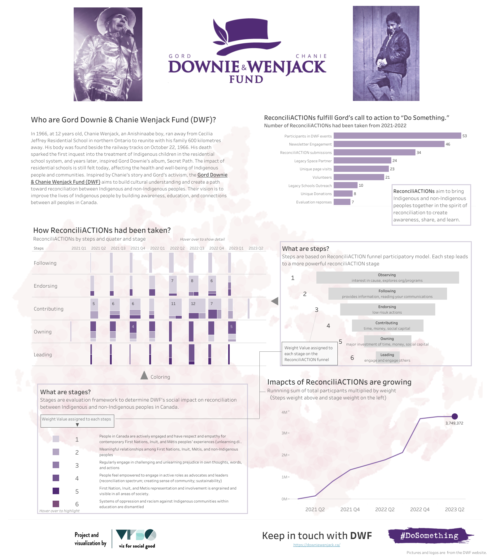
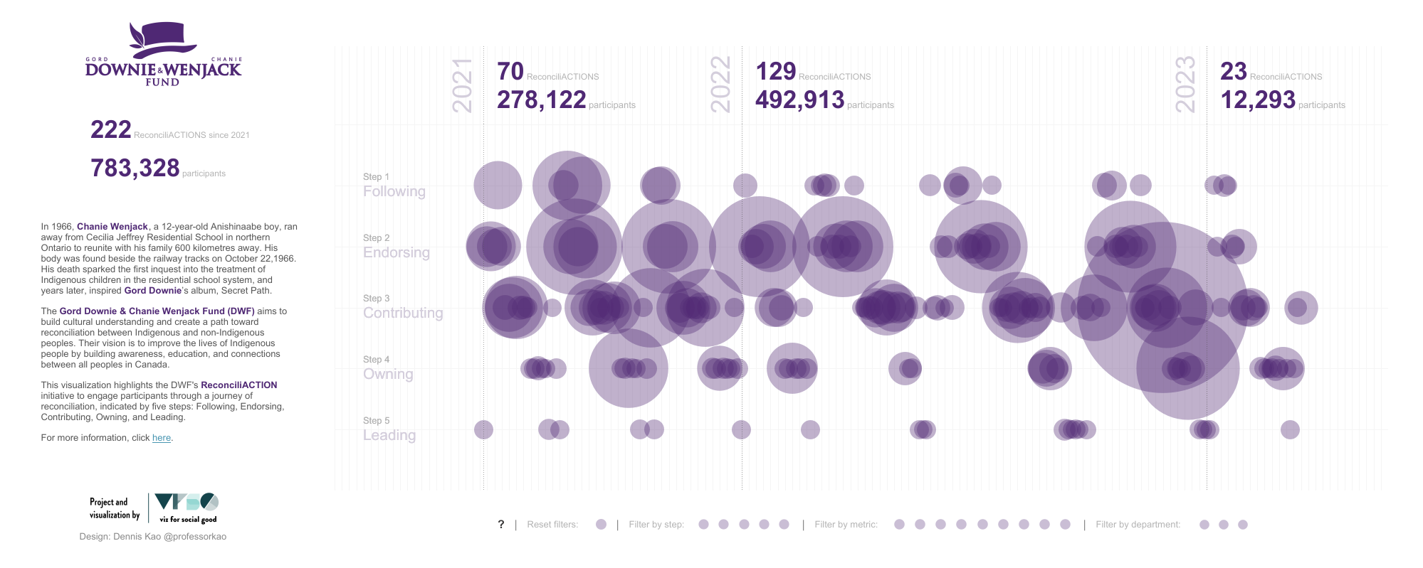
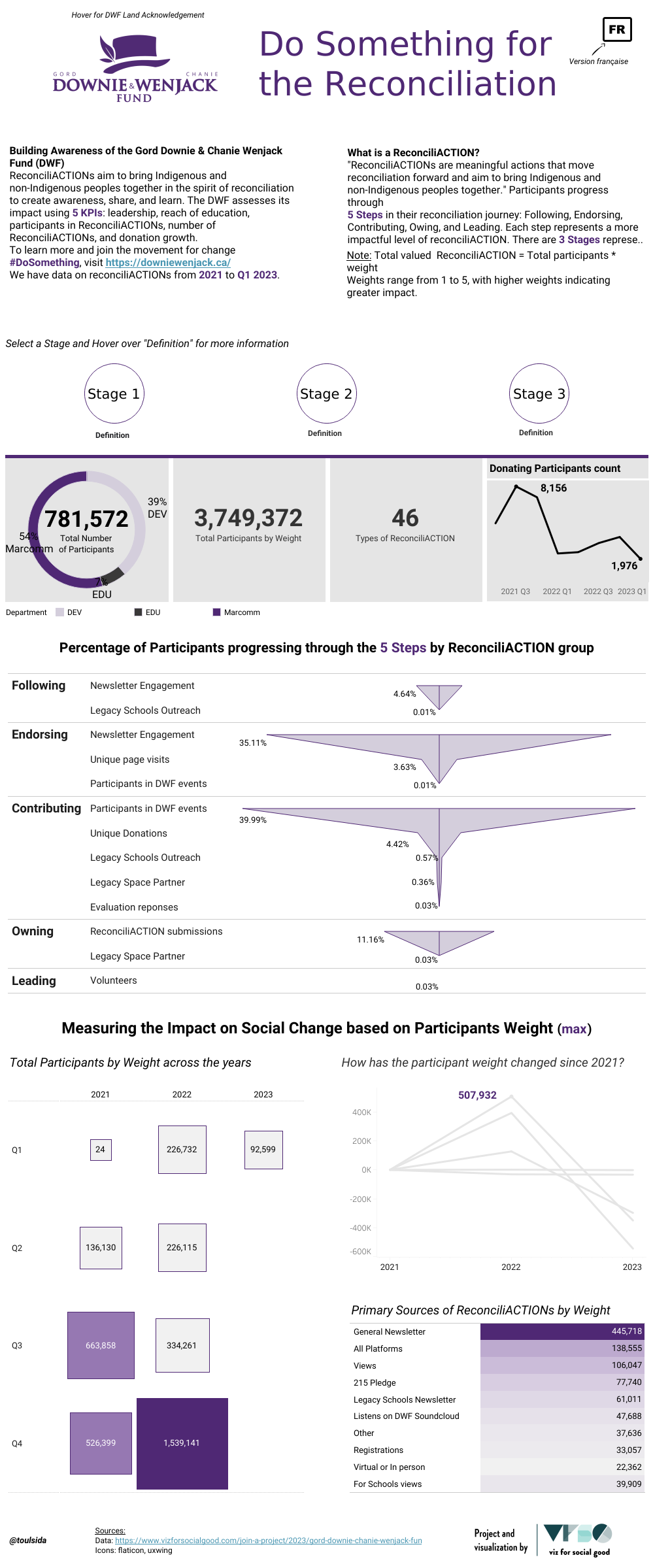
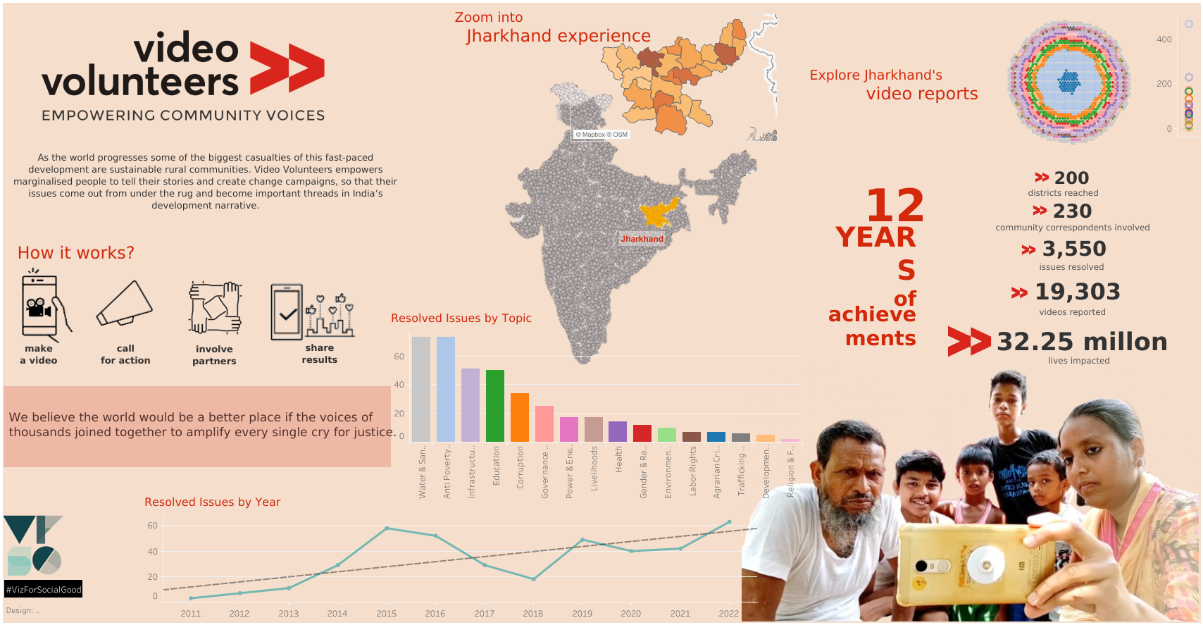
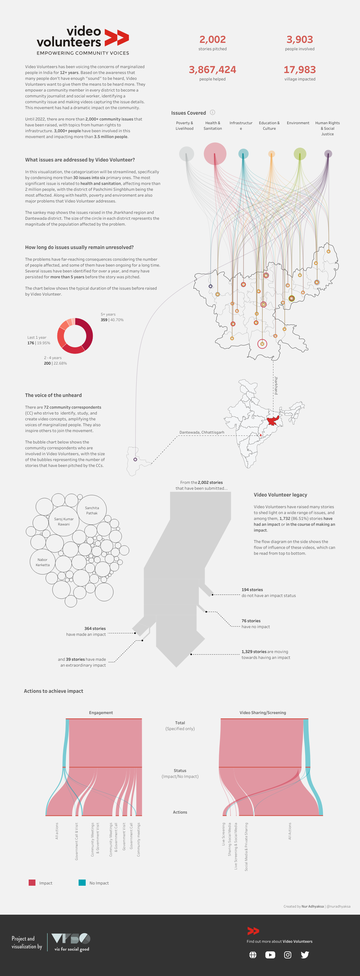
GDRI aims to show the world that international deaf people exist and their voices matter using data and analytics through the lens of research via community needs assessment. The most powerful tool we have against these systems is data. We can use data collection as a stepping stone to effectively advocate for the civil and linguistic rights of the deaf community. The advantages of doing this research are to provide data that will aid the deaf community in advocating for their needs, creating more job opportunities, improving accessibility in places like healthcare, and providing funds through grants and other avenues. This scientific research project will co-produce knowledge with the community and can be presented to stakeholders at multiple levels of decision-making to advocate for policy change and better services to improve deaf people’s quality of life.

The Global Deaf Research Institute is a pioneering, deaf-led research collaborative conducting deaf-specific research to understand the challenges faced by deaf communities around the world. We work closely with local deaf organizations in order to center them in the design and implementation of our systemic barrier research and continue this partnership after publishing to ensure the data is used to affect policy, secure funding, and make concrete positive differences in the daily lives of deaf people.

Project Brief

We believe data is a powerful tool to fight oppression. The first step to supporting efforts to improve deaf quality of life in a country is to deploy systemic barrier research on the social determinants of health for deaf people in the country. GDRI will partner closely with local deaf organizations in order to center their perspective in the deployment of our community needs assessment.

After we have collected and analyzed this data, we will continue to work with our deaf partner organizations to provide policymakers and stakeholders with actionable insights to address the needs of deaf individuals in the country. Through collaborative efforts with policymakers, stakeholders, and community members, we believe that our data-driven advocacy will help catalyze positive change and improve the lives of deaf individuals in the country." 

Call to Action

Globally, health research historically overlooks deaf populations. Published data on deaf populations disaggregated from general disability data is almost non-existent, depriving deaf communities worldwide of full access to healthcare, support from their governments, and the ability to thrive as autonomous individuals. Such data are crucial for advocacy efforts, policy changes, and securing funding for local organizations dedicated to addressing the unique challenges faced by deaf individuals.
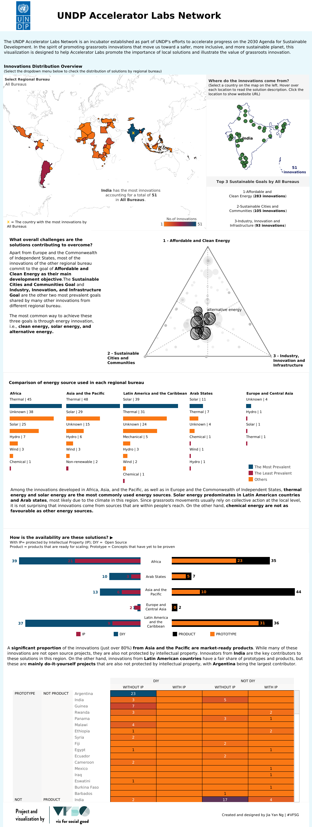
About the Data

The pilot implementation of Deaf Community Research, conducted in Nigeria in November 2023. The main goal of this research was to refine and implement our quality of life assessment tool, which incorporates the quality of life assessment tool disseminated by the World Health Organization, Quality of Life Brief Version (WHOQOL-BREF), with additional tailored questions focusing on barriers and accessibility.  

We segmented the country into six regions (Northeast, North, Northwest, Southeast, South, Southwest) and travelled to each of the six, spending a total of 20 days administering the survey to 225 deaf Nigerians, with nearly balanced gender participation of 133 male and 92 female participants, in partnership with the organization Deaf Worlds and Nigeria National Association of the Deaf. Our approach is consultative, inclusive, and participatory in data gathering.

Key Dates

Data

  • Download data (it is preferred that only this data is used for the project)

We are welcoming Steve Wexler as mentor

Steve Wexler is the founder of Data Revelations, author of "The Big Picture: How to Use Data Visualization to Make Better Decisions--Faster" and co-author of "The Big Book of Dashboards."
Download Visualisation Survey Data Whitepaper that will help you getting started.

Tools

You can use any tool or software you want: Tableau, PowerBi, R, Python, legos, pen and paper.

Include VFSG logo to your dashboards

In order to promote VSFG and protect your work, can we please ask you to include the VFSG logo on your dashboards (eg bottom footer section is fine). LInks to logos: https://drive.google.com/drive/folders/1PAASrdzYzQr47Rlp0yLhR4yuE4FtwJE-?usp=sharing

Support

Use Slack to ask questions #02_project_discussion

View Event →

Visualizing the Social Impact of Viz for Social Good
Mar
15
to Apr 19

Visualizing the Social Impact of Viz for Social Good

Visualizing the Social Impact of Viz for Social Good

Welcome to our Impact journey!

Join us on a visual journey that showcases the incredible strides we've made together. Picture a world where each dot on a map represents a beacon of change – that's the story we're eager to share. We're not just sharing numbers, we’re telling the stories of real lives touched and communities transformed.

Project Brief

Let's illuminate the power of data visualization in driving social change. Your creativity and expertise can help us tell the story of Viz for Social Good's impact and inspire further action for the betterment of communities worldwide.

Viz for Social Good is a non-profit that leverages the power of data visualization to support non-profit organizations and promote social causes. By collaborating with various charities, Viz for Social Good has facilitated numerous projects aimed at addressing critical issues around the globe. This project seeks to showcase the collective impact of these initiatives, demonstrating the significant contributions made to various causes and the benefits realized by communities and stakeholders.

The aim of this project is to create a series of data visualizations that highlight the cumulative social impact of Viz for Social Good's collaborations with charity partners. These visualizations will serve to illustrate the breadth and depth of change effected through these projects, encompassing a range of causes and outcomes.


Stories of change & Power of participation

Take us through the data stories of specific projects that have left a lasting mark. Show us the mosaic of volunteer efforts, where every piece is a contribution to the success of our mission. We need your help to demonstrate the tangible benefits and changes brought about by these projects, such as improvements in health outcomes and educational access.


Call to Action

We need your help to demonstrate the tangible benefits and changes brought about by the projects, such as improvements in health outcomes, educational access, environmental sustainability, and economic opportunities.

Emphasize the collaborative nature of the work, showcasing how partnerships between Viz for Social Good, its volunteers, and charity partners have driven positive change.

Encourage continued support and engagement from the community, potential volunteers, and partners by illustrating the value and impact of these projects.

Motivate the audience to support future projects by volunteering, partnering, donating or spreading the word about Viz for Social Good's mission and achievements.


Audience

The primary audience includes potential volunteers, current and prospective charity partners, funders, and the broader community interested in social good and data visualization.

Let's illuminate the power of data visualization in driving social change. Your creativity and expertise can help us tell the story of Viz for Social Good's impact and inspire further action for the betterment of communities worldwide.

Use of Data Visualization

Visualizations and stories shared will be showcased on our social media platforms, website, external and internal presentations, conferences and other publications. 

Key Dates

  • Project Starts: 15 March 2024

  • Live Presentations: 19 April 2024 | Recording

    Guest Judge: Adam Mico
    Adam Mico is the Principal, Data Visualization Enablement and Fluency at Moderna. He is a published author, a Data Leadership Collaborative advisory board member, a Dreamforce Golden Hoodie recipient, a 3x Tableau Visionary & 2x Michael W. Cristiani Community Leadership Award Winner (Tableau Conference).

Top 5 volunteers selected

Gabrielle Schroeder data art visualizing each VFSG project

Data

Tools

You can use any tool or software you want: Tableau, PowerBi, R, Python, legos, pen and paper!

Include VFSG logo to your dashboards

In order to promote VSFG and protect your work, can we please ask you to include the VFSG logo on your dashboards (eg bottom footer section is fine). LInks to logos: https://drive.google.com/drive/folders/1PAASrdzYzQr47Rlp0yLhR4yuE4FtwJE-?usp=sharing

Support

Use Slack to ask questions #02_project_discussion

View Event →
Physicalizing Data for a Better World
Oct
19
to Nov 23

Physicalizing Data for a Better World

Physicalizing Data for a Better World

Calling all data enthusiasts and imaginative minds: Have you ever considered how it would be to experience data in a physical, tangible form? If so, get ready for VFSG’s Physicalizing Data for a Better World—a unique collaborative project that brings imagination, data visualisation, and storytelling together in a way you've never seen before.

Physicalizing Data for a Better World


About the Project

What is Data Physicalization?

Data physicalization goes beyond traditional data visualization by converting digital insights into three-dimensional, physical objects. It’s a bar chart assembled from Lego blocks or a scatter plot designed using a variety of cupcakes. The goal is to make complex data relatable, intuitive, and physically interactive.

Examples of Data Physicalisation

  • Climate Change: Imagine representing global warming trends through layers of coloured sand in a glass jar.

  • Ocean Acidification: Create pH level indicators using different shades of blue marbles in a fish tank.

  • Sustainability: Utilise reusable items to construct a bar chart showing recycling rates in various regions.

  • Pollution: Develop a cityscape model where the height of buildings corresponds to pollution levels in different areas.

Our Project Focus: Environmental Impact

This project's primary objective is to showcase environmental impact. You should aim to develop physical objects that vividly and tangibly depict the data surrounding pressing environmental concerns — from pollution and ocean acidification to sustainable solutions that reduce, reuse, or recycle elements.

Intergenerational Collaboration

We’re combining the seasoned understanding of data professionals with the vibrant imagination of younger minds. Whether you're an adult pairing with a child, a teacher with a student, or simply connecting to your inner child, all collaborative efforts are welcome.

Note: AI-generated images will not be accepted; the emphasis is on tangible, physical representations.

Call to Action

  • Capture a photo of your finished physical data object to share with us.

  • Document your journey from concept to final product.

  • Tell us how you worked collaboratively to bring your data physicalization to life.

  • Create a brief video (1 minute or less) highlighting the most memorable moments of your project.

Target Audience

  • Data Enthusiasts: Engage with data in a new way.

  • Young Creatives: Bring data physicalization into your school projects or extracurricular activities.

  • Families: Participate in an enriching and educational family venture.

  • The Curious: If you don't fit the above categories, channel your younger self and unleash your creativity.

Key Dates

Selected volunteers submissions (click image in carousel)

  • Victor Muñoz

  • Mandy Spaltman

  • Damien Da Costa


Data

Choose from a rich array of environmental data sets:

Alternatively, research for other environmental impact-related datasets or collect your own data for a personalized touch.

Resources and inspiration

Check the separate document.

If you plan to join in with children, you can use some of the data activity & educator kits from Tableau to create your own datasets. (LINK) (LINK 2)

Support

Use Slack to ask questions #02_project_discussion

View Event →
The Centro de Pensamiento Estratégico Internacional (CEPEI)
Aug
1
to Sep 1

The Centro de Pensamiento Estratégico Internacional (CEPEI)

The Centro de Pensamiento Estratégico Internacional (CEPEI)

The Centro de Pensamiento Estratégico Internacional (Cepei) is an independent think tank headquartered in Bogota, Colombia. Over 20 years, they have worked to develop a detailed understanding of global, regional, and national policy processes that support the 2030 Agenda and the SDGs. Their mission is to strengthen political processes at the highest governance levels, enabling governments and their partners to better deliver on their sustainable development objectives.

2030 Agenda for Sustainable Development

Since inception, Cepei has been tracking global and regional processes from a Latin American perspective. They’re now translating these lessons learned from Latin America for other regions’ use. By taking a regional perspective and being an ambassador for other regions, Cepei offers a new response to the emerging trends of transboundary, polycentric governance.


About the Project

Over the last decade, Cepei has developed a profoundly specialized understanding of the Latin American and Caribbean Voluntary National Review process and transfers knowledge and designs tools that support decision-makers in managing the challenges of making more effective and informed decisions on sustainable development policies.

The SDGVQT provides VNR information for decision-makers monitoring and reporting progress toward meeting the SDGs in Latin America and the Caribbean. The Tracker offers easy and customizable access to relevant data, including the experts’ analysis for the 2030 Agenda reporting. It also helps design data-informed public policies to promote sustainable development at the national and regional levels.

The SDGVQT is robust, tracking the quality of every VNR submitted to the HLPF by LAC countries, analyzing the institutional frameworks for SDG implementation and the quality of the national data ecosystems, and providing recommendations to reporting countries on VNR drafting and presentation.

  • Specialized: developed for SDG decision-makers and those who influence them, multilateral organizations, governments, media platforms, and fact-checkers. The findings support the work of academia, civil society, and the private sector.

  • User-friendly: insights, visualizations, and country fact sheets enhance the user experience and allow planners and decision-makers to follow how countries monitor and report the SDGs easily.

Thanks to the SDGVQT, demand-driven data analysis, and evidence has leveraged advocacy strategies for international Fora, such as the UN LAC SDG Regional Forum, the UN High-Level Political Forum, the UN World Data Forum, the UN General Assembly, and the SDG Summit.

The platform comprises three dashboards:

  • A VNR Quality Index, which measures the quality of the VNRs according to their degree of alignment with the reporting commitments established in the 2030 Agenda and related instruments

  • An SDG National Governance Quality Index, which analyzes the governance structure established by each Latin American and Caribbean country for SDG implementation and monitoring

  • An SDG Help Desk that provides reporting countries with concrete suggestions for improving VNR quality based on Cepei’s seven years of experience analyzing reports


Call to Action

Generate demand-driven data analysis and evidence to support decision-makers working on monitoring and reporting progress toward meeting the SDGs in Latin America and the Caribbean.


Target Audience

Our main interlocuters are governments at national and local levels, with whom we work to promote the SDGs, strengthen their data and evidence inputs, and support policy processes. Audience: Government officials (decision-makers and those who influence them) responsible for SDG policy making, implementation, and monitoring.

Multilateral organizations: We work at the most senior levels of the UN system to strengthen the institutions supporting global sustainable development, particularly regional and national data and statistical systems.

Civil Society Organizations: NGO partners from universities, think tanks, and international charities to private companies, with a particular emphasis on those specializing in data for stakeholder engagement and contributing to sustainable development.


Web/Social Media

Website | Twitter | Linkedin


Key Dates

Project live kick-off:  | Recording

Submission deadline: 24/08/2023 | Submission form

Live presentations: | Recording

Selected volunteers submissions (click image in carousel)


Data

Download 4 files + includes data glossaries

Please find here a file with the brand stylebook and logo, and SDG icons.


Support

Use Slack to ask questions #02_project_discussion

View Event →
Gord Downie & Chanie Wenjack Fund
Jun
9
to Jul 18

Gord Downie & Chanie Wenjack Fund

Building Awareness of the Gord Downie & Chanie Wenjack Fund (DWF)

ReconciliACTIONs aim to bring Indigenous and non-Indigenous peoples together in the spirit of reconciliation to create awareness, share, and learn. They act as a catalyst for important conversations and meaningful change, recognizing that change starts with every one of us. ReconciliACTIONs fulfill Gord’s call to action to “Do Something.”

 The Secret Path and the Fund

In 1966, at 12 years old, Chanie Wenjack, an Anishinaabe boy, ran away from Cecilia Jeffrey Residential School in northern Ontario to reunite with his family 600 kilometres away. His body was found beside the railway tracks on October 22, 1966. His death sparked the first inquest into the treatment of Indigenous children in the residential school system, and years later, inspired Gord Downie’s album, Secret Path.

The impact of residential schools is still felt today, affecting the health and well-being of Indigenous people and communities. Inspired by Chanie’s story and Gord’s activism, the Gord Downie & Chanie Wenjack Fund (DWF) aims to build cultural understanding and create a path toward reconciliation between Indigenous and non-Indigenous peoples. Their vision is to improve the lives of Indigenous people by building awareness, education, and connections between all peoples in Canada.

About the Project

DWF calls upon all people in Canada to take reconciliACTION to move reconciliation forward. DWF measures its impact based on five key performance indicators: Thought Leadership, Reach of Education, Participants in ReconciliACTIONs, Number of ReconciliACTIONs, and Donation Growth. ReconciliACTION data is tracked via an engagement funnel where reconciliACTIONs are categorized into phases and participants move through the phases starting with observing, following, endorsing, contributing, owning, and leading, as they continue on their reconciliation journey. ReconciliACTION data helps identify the impact on an individual level, which influences impact at the community and systems level.

Call to Action

Do something. Take reconciliACTION today.
ReconciliACTIONs are meaningful actions that move reconciliation forward and aim to bring Indigenous and non-Indigenous peoples together. ReconciliACTIONs act as the catalyst for important conversations and meaningful change, recognizing that change starts with every one of us and each person can make an impact.

We need your help to tell the story of Reconcilaction progress.


Target Audience

Average Canadian – The average Canadian is familiar with the word ‘reconciliation’ but the frame of reference remains more political than personal. They are not sure how they fit in, what to do or where to start but the collective reconciliation journey requires all Canadians to actively participate in moving it forward.

Youth – Young people are the real agents of change. The more they learn, the more they share. They are energized and motivated to make a difference.

Educators – Teachers need more support than ever before and appreciate the high-quality educational tools and resources provided by DWF. While residential schools have caused irreparable harm to generations of Indigenous people, today’s educational institutions have an opportunity to leave a new legacy.

Parents - Parents are looking for ways to begin sharing the difficult history of Canada, and instilling understanding and empathy is of great value to families and communities.

Companies and Organizations – More companies and organizations are not only recognizing the value of reconciliation but wanting to set an example in their respective industries. It can be a daunting undertaking to understand how and where to start. DWF offers several ways to bring value and, in turn, can benefit from increased sponsorship, new followers, and added credibility and recognition.

Data

Download Data

Branding Guidelines | Language Style Guide

Web/Social Media

Website | FaceBook | Youtube | Instagram

Key Dates

Project live kick-off:  09/06/2023 | Recording | Slides

Submission deadline: 07/07/2023 | Submission form

Live presentations: 18/07/2023 | Recording


Selected volunteers submissions (click image in carousel) (Recording)

  1. Kate S

  2. Jill Brown for Ammu Fredy

  3. Satoshi Ganeko

  4. Dennis Kao

  5. Gabrielle

  6. Valerie Compaore


Support

Use Slack to ask questions #02_project_discussion

View Event →
World Health Organization (WHO)
Apr
18
to Jun 6

World Health Organization (WHO)

Transforming Data into Accessible Visualizations for Positive Change

The World Health Organization (WHO) is committed to building a world in which all people attain the highest possible standard of health and well-being.

Nearly 1.3 billion people, or 16% of the world's population, have a significant disabilities. Persons with disabilities deserve the same right to good health as anyone else. Our healthcare systems need to be accessible and inclusive for everyone, including persons with disabilities.

About the Project

Breaking down barriers to health equity through disability inclusion

WHO's report on health equity for people with disabilities shows we still have a long way to go. People with disabilities still die earlier, have worse health, and face more challenges in their daily lives than others. Countries are legally obligated under human rights law to tackle these health disparities for people with disabilities. We must ensure everyone has access to good health to achieve Sustainable Development Goals and global health targets.

The report urges WHO Member States to improve health equity for individuals with disabilities. It invites civil society, including disability organizations and other health stakeholders, to work together and advocate for the adoption of the report's recommendations and strive for optimal health for all. 

It offers 40 concrete and comprehensive actions nations can take to improve their health systems and eliminate health disparities for individuals with disabilities. No matter the circumstances or resources available, all governments and health partners must commit to placing health equity for individuals with disabilities at the forefront of health initiatives, empowering and involving these individuals, and monitoring their outcomes.

Call to Action

Help Viz for Social Good illustrate the power of digital accessibility and create a more inclusive experience for all. We need visuals that are easy to understand and can pack a punch. Get creative and don’t be afraid to think outside the box.

Target Audience

General public, member states, international donor communities, and academia.

Use of Data Visualization

Websites, social media, reports, advocacy presentations, and other communications.

Data

·         Download data

·         NOTE: You have exclusive rights to use the photographs solely for the purpose of the challenge. WHO retains the right to restrict use of photographs provided.)

Tools

We respect your tool of choice; for this project, we encourage you to use an opensource tool such as Kendo UI or one of the following for your visualization: ESRI ArcGIS, MS Power BI, R-Shiny and Salesforce Tableau.

Guidance

To create an inclusive digital environment, it's important to strive for universal access. This is a comprehensive idea that goes beyond just accessibility, and considers various elements such as cultural, economic, linguistic differences, along with the needs of individuals with disabilities, to ensure that everyone can fully participate without any barriers.

Make sure your visualization is clear, easy to understand, and accessible to as many people as possible. Please comply with web accessibility standards from W3C WCAG 2.1 and the WHO data design principles. Check out some evaluation tools on the W2C site for web accessibility that assist in assessing whether web content complies with accessibility standards.

  • Use appropriate labeling, scales, and colors.

  • Make sure that your visualization is also readable by screen readers and provide alternative forms of representation.

  • Be sure to include a variety of visuals that are interactive with synchronized filters for Highlights, Proportion, Table, Map, and Text.

  • Once you've finished your visualization, submit it to the competition indicating which tool you used to create the visualization, as well as a brief narrative to:

    • explain the question or insight you were exploring, and the choices you made in creating the visualization.

    • explain how you have considered “universal access” and “accessibility” in your design and implementation.

    • List of Open Source Accessibility Tools

When you submit your work, please let us know if we have permission to share your submission publicly. Some submissions may be featured in an online visualization gallery as examples of well-designed, accessible visualizations to inspire others in their data visualization efforts and create awareness about disability and health equity.

When evaluating visualizations, we will be examining:

  • Design - ensuring adherence to universal access and accessibility standards (WCAG 2.1),

  • Impact - making sure the message is communicated effectively,

  • Storytelling - bringing the data to life, making it easier for the audience to understand and remember the key insights.

NOTE: Please be advised that we reserve the right to reject any submissions that do not align with the values, theme, or purpose of the challenge.


Key Dates

Selected volunteers submissions (click image in carousel)


Support

Use Slack to ask questions #02_project_discussion

We are also going to try #feedbackfriday on Slack. Connect on Fridays to ask or give feedback about your data visualization.

View Event →
Video Volunteers - India
Feb
17
to Mar 17

Video Volunteers - India

 Video Volunteers - India

Everyone agrees that community voices matter. While this is fantastic in theory, what would it look like in practice?

While a few could potentially argue that in today’s digital age everyone is connected, we learnt that that's not fully true. While to some extent urban India does seem to use platforms like twitter to raise their voices, rural communities adoption into such platforms is very low (There are only 23.6 Million Indian Twitter users.

Source. India has over a billion people. So not even 2 percentage of India is on the platform)

Everyone, including the GPSDD is now talking about the importance of community voices in all efforts. What is the opportunity with tech to visualize and scale this?

We would love your help to create a community dashboard of citizen voices (of all kinds) that could be filtered across various categories using community video data of issues and impacts shared below.

Our model over the last 12+ years has been simple. We empower a community member in every district to become a community journalist and social worker and we call them Community Correspondents. They identify a community issue (could be health related, water, gender, etc) and make the first video called the issue video capturing the issue details. Post this, they show this to relevant local officials and work on solving the issue the video is about. As the issue is resolved, they create another video calling it the impact video. This video inspires others to act. Each video is tagged to multiple data relating to the issue and impact. 1 out of every 5 videos today are resolved. And we believe, being able to show our community data in a powerful visualization would help us double our impact rate.

Our target audience

The Community Correspondent, the community and local government officials. We want to create a visualization that a community when looking at feels that their voices are captured effectively on the platform and officials are able to act on insights of the community

Solutions will be hosted on our website, and volunteers will receive a letter of appreciation as a recognition for their contributions.

About Video Volunteers

Video Volunteers empowers marginalized people to tell their stories and create change campaigns, revealing the inequities in the communities that will help them become important threads in India’s development narrative. We believe change begins when the voices of thousands join together to amplify every single cry for justice.

Guiding Questions

  • We created this very simple visualization. Please help us improve this

  • How can we use this data and videos to tell a better story and give a better picture of various districts

  • How can we view this data from a public communications perspective to capture the attention of partners and potential collaborators? How can we present this data in a way that makes it stand out and be impactful?

Other questions

  1. What are the major issues affecting various regions, groups of stakeholders and how many people are being affected by these issues?

  2. What is the average duration of a community issue (across issues) before it is resolved?

  3. How does community engagement and participation impact the resolution of reported issues?


Please note - As the data was captured by various volunteers over a decade, its not entirely clean. It also over a period of time has had additional columns added to it for capturing nuanced data which might also result in some data missing for old data.

Data

Link to Google Drive

Social Media

Website | Youtube | Instagram | Twitter

Key Dates

Support

Use Slack to ask questions #02_project_discussion

Selected volunteers submissions (click image in carousel)

View Event →
UNDP Accelerator Labs Network
Oct
2
to Oct 23

UNDP Accelerator Labs Network

UNDP Accelerator Labs Network

UNDP’s Accelerator Labs were built in 2019 to change the way UNDP does development by learning what works and what doesn’t in sustainable development to reach the Sustainable Development Goals (SDGs) in time.

Because of the speed, dynamics and complexity of today’s challenges we’re not progressing fast enough, and current development practices must keep up with the pace of change. The UNDP Accelerator Labs are designed to close the gap between the current practices of international development and the accelerated pace of change.

 The Network of Accelerator Labs is composed of 91 Lab teams covering 115 countries to tap into local innovations for actionable insights and reimagine sustainable development for the 21st century. The Accelerator Labs are designed to close the gap between the current practices of international development and the accelerated pace of change.

 Each Lab is comprised of three team members: Head of Solutions MappingHead of Experimentation, and Head of Exploration.

Project Information 

UNDP’s Strategic Plan (2022 – 2025) sets out the ambitious objective to increase access to clean and affordable energy for 500 million people by speeding up investment in distributed renewable energy solutions, especially for those hardest to reach and in crisis context. While large grid and financial flows at scale are essential to reach this goal, our Discover and Deploy Solutions Mapping campaign will explore bottom-up, lead user, frugal and grassroots innovations as a contribution to the sustainable energy access moonshot.

Over the course of 4 months, our network of solutions mappers has discovered 359 grassroots energy solutions from across different regions, demographics and energy sources. The discovered solutions help us to signify the importance of already existing grassroots solutions to energy conservation, augmentation, generation, storage, and distribution in early-stage use. Albeit these are often not yet distributed at scale their existence offers valuable insights and trends on how communities are overcoming their own challenges. We need to acknowledge the ingenuity and problem solving capacity found in many communities that in turn can feed into UNDP's programming and contribute to achieving UNDP’s ambitious mission moonshot.

Visualising the data is essential to help us advocate for the importance of local solutions, their added value and contribution to development at a time when innovation is direly needed given the emergence of contemporaneous crises and inertia in inter-governmental climate negotiations.

We expect to feature your data visualizations for our global communication campaign during the 2022 United Nations Climate Change Conference (COP 27), 6 – 18 November 2022.

Call-to-Action  

Help us to showcase the value of grassroots innovation! We need easy to understand, yet powerful visualizations of the energy solutions we discovered that help us advocate for a more sustainable future. Be bold and creative. Cut the data in as many ways as possible – maybe you see something that we don’t?

Some guiding questions on what we look for:

  • Where are the solutions coming from? What is their distribution per country & per region?

  • What type of energy source is more prevalent, what is less? Are there differences per region, and why?

  • What are global commonalities across solutions; what are typical applications & use cases for solutions? Are there patterns that emerge when looking at the distribution per country & per region?

  • What overall challenges are the solutions addressing or contributing to overcome?

  • Which Sustainable Development Goals are the solutions advancing in particular, and how?

  • Looking at the use case of clean cooking solutions, what is their prevalence, distribution, and source of energy?


If applicable / information is available*:

  • How are the solutions solving a specific community problem? What are the solutions addressing or contribute to solving? (if applicable)

  • How can we display the more quantitative information (ratio of IP vs DIY solutions; Prototype vs Product) in an appealing way that signifies the availability of solutions in country? (if applicable)

…and any other pattern you may come up with!

Brownie points for GIF animations / dynamic data visualizations and infographics usable for social media and beyond as we intend to share your work for our global #PeoplePowered energy campaign in the run up of the United Nations Climate Change Conference (COP 27), 6 – 18 November 2022.

*Due to the global nature of our solutions mapping practice, which might differ from country to country, there is unfortunately some sparsity in the available data.

Audience 

Government partners, international donor community, Development practitioners, Climate experts, Academia, the general public

Use of Data Visualisation

United Nations Climate Change Conference (COP 27), UNDP Accelerator Lab Website, Social media channels (Instagram, twitter), Annual reports, Blogs, other communications means

Data

Key dates

Slack

Join Slack channel here

Selected volunteers submissions (click image in carousel)

View Event →
India Water Portal/Arghyam
Sep
2
to Sep 30

India Water Portal/Arghyam

India Water Portal/Arghyam

Water insecurity is a large-scale problem in most parts of the world. It is even more so in developing countries like India where access to safe drinking water is still a piped dream for many. Water, in policy and management, is highly fragmented and governed across multiple departments. And of course, because of its nexus with other major economic sectors like agriculture and industries, its management has been historically a challenge and continues to be so even now. 


India Water Portal is an open knowledge platform on water supported by Arghyam. One of the objectives of the platform is to generate mass awareness on the scale and seriousness of water issues in India; and bring policy attention to emerging trends on water.


Project Information 

Lack of data at a single place for better governance, policy design and decision making is a gap and India Water Portal has been trying to address that by hosting publicly available datasets or links to them on the platform. But for most of the datasets, the formats are not user-friendly, and very few indicators have readily available visualizations that can aid quick understanding of problems and support awareness and decision making. With a reader base of more than 8 million in English and Hindi, the Portal has the power to generate discussions on macro level shifts on important indicators that highlight water security challenges.


We need dashboards, visualizations, and data storyboards of some or all of the indicators listed below. Contributors will be duly credited on the Portal for their contribution to sectoral asset creation.


  • Per capita water availability in India (last 30 years)

  • Water use by sectors (agriculture, industry, domestic, others)

  • Water use by source (groundwater, surface water)

  • Rainfall trends in water stressed regions of the country (last 30 years)

  • Blocks and districts with water quality issues (fluoride, arsenic, iron, biological contaminants, others)

  • Status of groundwater development (critical, overexploited blocks)

  • Total groundwater extraction trend comparison (India, China, USA)

  • Trends in borewell and deep tubewell structures in India (last 4 minor irrigation census)

Call-to-Action  

Help solve the problem of lack of awareness and sufficient focus of water issues and the alarming rate of aggravation of the same by sharing these findings with your network and contributing any kind of relevant content to India Water Portal.

Audience 

General public, youth looking to enter civil services and policy jobs, government functionaries working on water, philanthropists, Civil Society actors

Use of Data Visualisation

Websites of IWP and Arghyam, social media, annual reports, advocacy presentations, other communications

Data

Download data from Google Drive

Key dates

  • Project kickoff: 2 September  | Recording

  • Deadline for volunteers to submit: 30 September | Submission form

  • Volunteer live presentations: 8 October 5 PM IST | Recording

View Event →
Bridges to Prosperity
Jun
10
to Jul 15

Bridges to Prosperity

Bridges to Prosperity

Nearly a billion people in rural communities throughout the world lack transportation access to critical destinations like health centers, schools, markets, and towns with employment opportunities. Bridges to Prosperity (B2P) works with isolated communities to build trail bridges over impassable rivers, and create lasting connections to essential services and opportunities.

To date, B2P has built more than 340 bridges that serve 1.1 million people in 20 countries. Its projects have been demonstrated to create a pivotal change in rural communities, with farm profits increasing by 75% and wage labor increasing by 36% following bridge construction. B2P currently operates programs in Rwanda and Uganda.

Project Information  

B2P is creating a suite of rural access briefs on key subject areas to illustrate the importance of consistent safe access in the rural context. Each brief is intended to be a digestible and engaging summary of the potential for trail bridges and other rural transportation infrastructure to effect significant change in the subject area at hand. 

For example, the Climate and Environment brief is intended to illustrate 1) the effect of climate change on rural communities and 2) the role of trail bridges in mitigating or reversing those effects. The example brief linked below is not complete, but shows how data visualisations could be used in a brief of this kind. B2P believes in evidence-based decision making, and the power of good information to change hearts and minds, and intends to design new briefs for each subject area around the data visualisations we feel most effectively convey the message of each brief. 

Example draft brief: https://bridges.box.com/s/7ljpy9qt9868kl7pkziv2fp8bearl72l

Make sure you watch the event kickoff recording.

This is the second project with Bridges to Prosperity and the data and challenges provided are quite different.
Based on "briefs", the data provided might be a single measure or no measure at all, and this will require the volunteers to be very creative to express those.
B2P has shared that sometimes it is a struggle to express something that's essentially a single measure in a way that's interesting and engaging.

Key messaging for each briefs

  • Climate change poses an acute threat to rural communities, and safe access mitigates that theat

  • Feeder roads are a proven intervention in the effort to end rural poverty, and trailbridges provide critical access to feeder roads

  • Trailbridges are a critical link between the urban and rural contexts

  • Trailbridges provide the consistent access that's required for agricultural life cycles and supply chains

Call-to-Action

Help solve the problem of rural isolation by donating, or sharing these findings with your network

Audience

National governments, private and governmental funding agencies

The briefs would be used as print and digital collateral to share with strategic partners and stakeholders, including institutional funder and government partners. If the volunteers could produce dashboards with elements that would convert well to print, that would be ideal!
— Bridges to Prosperity

Two kickoff events

We will have 2 kickoff events. Abbie Noriega, VP of Evaluation of Bridges to Prosperity will share with us information about the briefs and required deliverables. 

The first part of these events will also be the launch of VFSG Champions, so don't miss these!

Watch recording of the first kickoff event

Deadline to submit

  • Project starts 10 June | Recording

  • Deadline to submit 15 July

  • Volunteers presentations to B2P 23 July | Recording

Access to data

Access the data here


How to participate

·   Sign up as a volunteer, if you haven’t already.

·   Join Viz for Social Good Slack and project channel #02_project-discussion

·   Submit your visualization to  https://forms.gle/QKEBUBTzpkeZKjZbA 

·   Use social media tags @B2P, @VizFSG, #vizforsocialgood

·   Attend a live virtual event on 23 July 7 am MDT(USA – Colorado), where you may get the opportunity to pitch your visualizations to the Bridges to Prosperity team. (Eventbrite RSVP link)

View Event →
Tap Elderly Women's Wisdom for Youth (TEWWY)
Mar
8
to Mar 29

Tap Elderly Women's Wisdom for Youth (TEWWY)

Tap Elderly Women's Wisdom for Youth (TEWWY)


Nearly 1 in 10 people have a mental health disorder, but only 1% of the global health workforce
provides mental health care. Mental, neurological and substance use (MNS) disorders interfere,
in substantial ways, with the ability of children to learn and the ability of adults to function in
families, at work, and in society at large. TEWWY taps the wisdom of grandmothers
(Wisdom&Wellness℠ Counselors - WWCs) to serve the mental health needs of vulnerable
populations. The WWCs implement psychosocial interventions to strengthen social supports
and bridge the intergenerational and mental health treatment gap.


To date, TEWWY’s Mental Health Intervention Programs (MHIPs) have reached 17,975 people
through its initiatives in Dar-es-Salaam’s 5 municipalities and in Kilwa, Lindi rural community.

Its projects have exposed a dire need of mental health care. The projects have been demonstrated
to create pivotal change in the communities; with increased help-seeking and growing
participation in interpersonal counseling and group talk therapy by community members.


Project Information


A key metric for the organization is the number of people with MNS conditions identified and
supported. WWCs administer a PRIME-MD diagnostic instrument for common mental disorders
— Patient Health Questionnaire-9 (PHQ-9) — to understand the depression severity and its
impact on the daily lives of people in Tanzania; plus additional multiple-choice and open-ended
questions regarding stressors and coping mechanisms.


Visualizing data from its depression severity survey will make it possible for TEWWY to
communicate the impact of the MHIP to key stakeholders, including communities, government
partners, and funders, as well as the general public. It will also help elevate the conversation
about mental health in Tanzania, and the importance of enacting mental health care in non-
communicable disease policies.

Call-to-Action
Help communicate the impact the MHIP has had in local communities in Dar-es-Salaam by
creating engaging data visualizations; to raise awareness and inspire support towards
mental health initiatives.


Audience
Government partners, funders, small donors, key stakeholders, and communities.

Data visualisation will be used on our media and communication channels - website, blog,
social media, progress and annual reports, grant applica2ons, and other communications

Data

  1. Patient Health Questionnaire (PHQ) - Choose between raw and pivoted data

  2. Stress Assessement - Choose between raw and pivoted data

  3. Extra data: Mental Health in Tanzania

Download data on Google Drive

Submissions

https://forms.gle/xcKCCjL1Zw1kdFFz6

Due date for submissions
29 March 2022

How to participate

  • Sign up as a volunteer, if you haven’t already.

  • Join Viz for Social Good Slack and project channel #02_project-discussion

  • Submit your visualization to  https://forms.gle/xcKCCjL1Zw1kdFFz6

  • Use social media tags @TEWWYWisdom, @VizFSG, #vizforsocialgood

  • Attend the live virtual event on 2nd April 2022 8PM BST London - Register to Live event

View Event →
Build up Nepal
Jan
9
to Feb 6

Build up Nepal

Build up Nepal

Build up Nepal is on a mission to break the vicious poverty cycle in rural Nepal through safe houses and long-term jobs for poor families. This is important because millions of families in rural Nepal live in deep poverty and are forced to migrate from their villages due to lack of jobs, housing, and economic development. The construction industry in Nepal are growing rapidly, presenting a unique opportunity to create jobs for poor families. But the conventional fired brick industry is responsible for poor working conditions, child labor and 37% of CO2 emissions from combustion in Nepal.

Build up Nepal’s solution - innovative micro-enterprise model combining two integrated solutions to overcome challenges faced by rural communities:

1) Low-cost, eco-friendly technology, safe housing for poor families

Build up Nepal specializes in CSEB Compressed Stabilized Earth Bricks, a recognized disaster resilient technology that uses local soil and sand with just 10% cement to produce bricks. Our off-grid machines are uniquely effective in rural areas, operating without fuel or electricity, reducing the cost of a house by 25% - making the dream of a safe house genuinely affordable for poor and low-income families.

2) Innovative micro-enterprise model, creating jobs for poor families

Build up Nepal recruits rural entrepreneurs and community groups to start micro construction enterprises. They invest their own money, hard work, sweat and tears, securing a strong incentive to build, sustain and grow over the long-term. We provide them with low-cost machines, training, and support to ignite each enterprise as a sustainable economic engine within poor communities.

To date, Build up Nepal has trained 287 entrepreneurs and communities to build 6009 houses, creating 2896 jobs. Building a house is the biggest investment a poor family will ever make. A cost reduction of 25% often means the difference of being able to build a 3-room house instead of 2-rooms for a family of eight, or the ability to build a house at all… 

Our experience shows that most of the jobs in the enterprises are held by poor people without stable income. Most jobs are held by disadvantaged groups and youth including 30% women. Average income for a CSEB brickmaker trained by us is $6-7 per day, a big step towards a life without poverty. By 2025 we aim to support 600 micro-enterprises to build 25,000 houses, creating 6600 jobs in poor, rural villages – where it is needed the most.

Project Information 

Key impact metrics for Build up Nepal:

1)            Houses built

2)            Jobs created

3)            Nr of enterprises established and sustaining long-term

4)            Tonnes of CO2 emissions saved

Visualizing the impact data will make it possible for Build up Nepal to communicate their impact to key stakeholders including communities and government in Nepal and funders. It will also help elevate the conversation about safe, hygienic housing in rural areas and the importance of prioritizing last mile infrastructure in development plans.

Call-to-Action Help solve the problem of sub-standard, unsafe housing and poverty in rural Nepal by creating some awesome visualizations of Build up Nepal’s data and share it with your network.

Audience Communities, government partners, funders, the general public

Use of Data Visualization Website, social media, annual reports, grant applications, other communications

Dataset: Link to Google Drive

Extra data: Refer to (Build up Nepal - Extra data) Word doc in Google Drive

Project live: 9 January

Deadline to submit: 06 February 2022

How to participate

  • Sign up as a volunteer, if you haven’t already.

  • Join Viz for Social Good Slack and project channel #02_project-discussion

  • Submit your visualization to  https://forms.gle/aajR2n1zz17PZ7Zj9

  • Use social media tags @BuildupNepal, @VizFSG, #vizforsocialgood

  • Attend the live virtual event on 11 Feb 2022 12 Noon CET - Register on Eventbrite

View Event →
Viz For Social Good – visualize our community
Nov
28
to Jan 7

Viz For Social Good – visualize our community

Viz for Social Good

Non-profits around the world are driving positive social change but some of them lack the in-house resources to effectively tell their story with the data they have. VFSG helps non-profits thrive by connecting talented community members with organizations in need of data visualization skill sets. Our community is at the core of everything we do and we are working to understand how well we represent the non-profits we support.

Project Information

A key success factor in VFSG engagement’s is how well our volunteer community understands and connects with the cause we are partnering with. To lay a strong foundation for this, we are looking to analyze our community base and ultimately identify where we should focus our efforts for recruiting as well as what non-profits would be the strongest to partner with going forward

Call-to-Action  

Help shape Viz For Social Good's Diversity & Inclusion efforts. Visualise a small subset of the anonymous data collected during the Viz For Social Good community poll last month.

Audience 

VFSG Community, VFSG Board, VFSG Committees, Future partner organizations

Data

Shared Dataset

Use of Data Visualisation

Social Media, Internal materials, other communications, Organization’s Tableau Public account

Include VFSG logo to your dashboards

In order to promote VSFG and protect your work, could we please ask you to include the VFSG logo on your dashboard (eg bottom footer section).
Link to logos

Submissions

Google form to submit visualizations: https://forms.gle/TJFkfnJRG4KgX7eeA

Deadline to submit

January 7, 2002 (no volunteers presentations this time)
We are going to have Mid January a 2022 kick off event to celebrate 2021 and start the new year.

View Event →
Sunny Street
Sep
5
to Sep 26

Sunny Street

Organization: Sunny Street

Sunny Street is changing the world by providing heartfelt healthcare to our community’s most vulnerable people.  We need to be able to clearly articulate our social impact to our stakeholders, collaborators and potential sponsors and funding sources.   We know that our outreach clinics benefit the lives of our patients, volunteers and the broader community through our authentic conversation-based model of care.  

One conversation between a Sunny Street volunteer and a patient can change the course of both of their lives.  We need to be able to capture the impact of this personal interaction through an individual’s lifetime – from the moment of conversation at a clinic and beyond and also consider the implications for their other personal relationships.

We want to be challenged on how we are currently collecting information and have conversations with data experts the goal of starting long-term collaborative relationships to secure Sunny Street’s sustainability.

Before the pandemic, in March 2020, a small group of Viz for Social Good volunteers in Brisbane, got together and organised a small local datathon with Sunny Street. Now, the landscape and the problem are very different. 

  • Our experience with data was in its infancy back then. Since the first project we have improved how we capture and use data.

  • We also now have almost 3 years of data available so can paint a better picture of our services. We would love to see how the service has changed since 2019.

  • Covid-19 certainly impacted our service, as so many clinics were forced to be cancelled, however, quite often we found that we still had the same or more conversations & consultations. We would love to see a pattern of whether the service uptake continues to increase as we go through the years and evolve the service. 

  • Also, we are also keen to see if the patient demographics have altered over the years from 2019 to 2021.

Call-to-Action  

How can the audience support your organization after reading the visualization? (e.g., donating, volunteering, mentoring)

Sunny Street values magic in relationships. We are actively seeking collaborations with brilliant data minds attached to big hearts.  Our organisation is agile, motivated and driven by passionate purpose to break down barriers to accessing healthcare for people experiencing homelessness and vulnerability.  

We want to research and understand the Health Economics of our service from patient level through to national impact and over the course of time.  We also need to quantify and qualify the effect our service has on Emergency Department presentations and representations, as well as access to mental health and addiction services.  

Audience 

Our target audience is all levels of state and federal government, philanthropists, corporate and consumer sponsors.  We will also be using this visual representation of our service data to seek grants and contracted medical service opportunities with hospitals and health services as well as Primary Health Networks.

Use of Data Visualization

We will use the visualisation on print, website and social media.  We also will include this information at speaking engagements and trade displays at conferences and events.

Include VFSG logo to your dashboards. In order to promote VSFG and protect your work, could we please ask you to include the VFSG logo on your dashboard (eg bottom footer section). Link to logos:

VFSG LOGO

Deadline to submit 26 September

Submissions due: Sep 26th, 2021
Live virtual event: Oct 1st, 2021 12:00 noon BST (London, United Kingdom)

How to participate

  • Sign up as a volunteer, if you haven’t already.

  • Join Viz for Social Good Slack and project channel #02_project-discussion

  • Submit your visualization to https://forms.gle/bU2CZyzw9fMseLZj7 and don’t forget to add the VFSG Logo to your visualisation

  • Use social media tags @VizFSG @hi_sunnystreet

  • Attend a live virtual event on 1 Oct 12:00 noon BST. If selected by the charity, you may get the opportunity to pitch your visualizations to the Sunny Street team.


View Event →
Crowd2Map
Apr
22
to May 20

Crowd2Map

Organization: Crowd2Map

Two billion people in rural communities throughout the world are not on proper maps, including 17 million in Tanzania.  This has many negative impacts for navigation, planning, and for activists protecting the up to 3 million girls at risk of Female Genital Mutilation, FGM.

In the last 5 years Crowd2Map, an entire volunteer project has recruited and trained over 16,000 online remote mappers who have added over 5 million buildings into OpenStreetMap. Better maps have helped save over 3000 girls from FGM.

Project Information 

Crowd2Map recognizes that everyone should be counted. Without accessible, good quality maps of rural Tanzania's progress towards the Sustainable Development Goals cannot be planned and measured at a village level. Therefore we are training local communities to add their local knowledge to base maps created from satellite images to open maps that everyone can access, use and develop. 

Visualizing how far we have come and how much is still to do is a priority to motivate our many volunteers and to track progress to aid planning. 


Call-to-Action  

Help communicate the impact that Crowd2Map has had to date by creating engaging data visualizations to visually communicate the achievements on the Crowd2Map website. 


Audience 

Potential partners, our volunteer mappers, the wider mapping community, the general public, and through feedback sessions hosted by local monitoring staff, communities


Use of Data Visualization

Website, social media, reports, other communications


Data


Deadline

Submissions due: May 20th, 2021
Live virtual event: May 28th, 2021 12:00 noon BST (London, United Kingdom)


How to participate

  • Sign up as a volunteer, if you haven’t already.

  • Join Viz for Social Good Slack and project channel #02_project-discussion

  • Submit your visualization to  Viz for Social Good – Crowd2map

  • Use social media tags @Crowd2Map, @VizFSG, #vizforsocialgood

  • Attend a live virtual event on 28 May 2021, 12:00 noon BST (London, United Kingdom), where you may get the opportunity to pitch your visualizations to the Crowd2Map team.


View Event →
Vera Aqua Vera Vita
Feb
20
to Mar 14

Vera Aqua Vera Vita

Organization

Mission: By tapping into the physical and spiritual nature of water, Vera Aqua Vera Vita empowers people and communities in developing countries to generate clean water and sanitation solutions that bring True Water True Life.

Approach: Vera Aqua Vera Vita strives to bring hope and charity to those it serves through empowering people while implementing convenient, economical, practical, and efficient water distribution, sanitation, and conservation systems in impoverished countries. Their programs also implement community-level educational programs to ensure sustainable approaches and knowledge sharing that empowers people to be the solution.

Vision: They envision a world where death, hardship, and poverty caused by lack of access to clean water and improved sanitation are no more. They desire to see people flow from simply surviving to truly thriving!

(See Separate Attachment for More Details)


Project Information 

We are looking for any kind of visualization that will tell compelling stories about our global efforts, the organization, and our impact on the neediest.  There is 1 primary focus area we want to shed light on:

  1. The Reality of the Challenges the People we Serve are Facing in Peru & around the World Due to the Global Water Crisis and thus the Fundamental Importance of Our Projects/Programs and Work! Suggested visualization: Global Water Crisis > Peru Water Crisis > 7 Needy Communities in the Piura Region of Water Crisis.


Call-to-Action   

  • People and Organizations can give the Gift of True Water True Life by donating, sponsoring, and awarding grants. For every $50 you donate, 1 person gets access to clean water for generations to come.

  • People can give the gift of their time as a volunteer.

  • People can join us in spreading awareness of the Global Water Crisis and telling others about the reality of the situation and what Vera Aqua Vera Vita is doing to solve it.

  • People can be in Solidarity with our less fortunate brothers and sisters by partaking in the Solidarity Gallon Challenge or by going on a Mission Trip.

  • People can join us in praying of the specific intentions of our mission and those we serve.


Audience 

  • General public

  • Funding organizations

  • Funding foundations

  • Schools, Colleges, and Universities


Use of Data Visualization

Website, social media, annual reports, grant apps, press releases, other communications.


Data/Resources

  • VAVV Data Viz for Social Good

    1. Attached one-page summary of the Why, What/Who, How, and Where of our organization. | Word Document

    2. Detailed Data of Challenging Situation in 7 Different Communities in the Piura Region of Peru. | Excel Document

  • VAVV High Resolution Logo Files (all transparent backgrounds)

    1. Color with Graphic/Icon & Words

    2. Color with just Graphic/Icon

    3. White with Graphic/Icon & Words

    4. White with just Graphic/Icon

    5. Black with Graphic/Icon & Words

  • Wealth of WASH Data: https://washdata.org/

  • Summary of VAVV Work: https://veraaquaveravita.org/our-work

  • Images/Photos: https://veraaquaveravita.org/projects-photo-gallery

  • Brand Colors:

    1. VAVV Blue:  34, 97, 174 (RGB)

    2. Standard Black

    3. Standard White


Deadline to submit

March 14th, 2021


How to participate

  • Sign up as a volunteer, if you have not already.

View Event →
Fondation Follereau Luxembourg
Jan
9
to Jan 31

Fondation Follereau Luxembourg

[English version] Ci-après en français

This project is bilingual so you will find the information and data in French and English. You decide in which language you prefer to make your visualization!


About Fondation Follereau:
Fondation Follereau Luxembourg (FFL), a Luxembourg-based NGO is committed to the prevention and promotion of the quality of life of the most vulnerable African communities. Alongside its trusted partners, FFL supports local, inclusive, and positive initiatives by responding to the needs of local teams in terms of health, education, protection, and emergency. Since 1966, the foundation has evolved with the times by developing its activities beyond its initial fight against social exclusion in the leprosy communities. Over the years, FFL’s focus has extended to strengthening local resources and infrastructure, as well as raising awareness for collective challenges in Africa. The foundation supports the 17 Sustainable Development Goals (SDG), which were set by the United Nations for 2030. Fondation Follereau Luxembourg ensures that local partners spearhead field projects and that these projects respond to needs expressed by the serviced community. Projects exist for and are led by the community, which ensures their impact and sustainability.


Project Information:

Our goal is to raise awareness about one or more of the topics FFL works on, to share the details of their work in different axes of intervention over the past years, and to be able to reach a larger audience to obtain donations that help FFL continue their work.

The audience is the general public.


About the data:

The data contains the different projects that the foundation has worked on during the last 3 years with the local partners, the budget allocation by project and country. The results are only available for 2018 and 2019 since 2020 results are not ready yet.

Useful Links:

We encourage the participants to add context to enrich your visualization with data about one or more specific topics from our axis of intervention. The following sites contain data about the different topics we work on:

  • https://databank.banquemondiale.org/source/world-development-indicators: the data may be of interest for all our projects since it concerns the Human Development Index data.

  • https://www.who.int/data/gho/data/indicators: data can be of interest for health projects when looking for specific information, in a particular country and a specific disease, treatment, access to care, etc.

  • https://data.unicef.org/resources/state-worlds-children-2016-statistical-tables/: the data may be of interest for projects where the beneficiaries are children/adolescents and can refer to the categories child protection (FGM, child trafficking, etc...), education, water and sanitation, maternal and child health, child nutrition, child mortality.

  • http://www.hdr.undp.org/en/data: as well as the World Bank link, this is data on various subjects, all related to human development. The data can be of interest for all our projects by selecting the categories: education, health, poverty, employment.

Deadline to submit

January 31, 2021

How to participate

·       Sign up as a volunteer, if you haven’t already.

·       Join Viz for Social Good Slack and project channel #project-2021-fondation-follereau.

·       Submit your visualization to https://docs.google.com/forms/d/1GkbCbKVpVK1MWD0UAYSxiOj9qyLfkN2I8WLF3GM7GRE/edit?usp=sharing_eil&ts=5ff6ba0c

·       Use social media tags @FFLuxembourg, @VizFSG, #vizforsocialgood

·       Attend a live virtual event on February 12th, 19:30 where you may get the opportunity to pitch your visualizations to the FFL team. RSVP here https://www.eventbrite.es/e/135926639237

[Version en français]

Ce projet est bilingue, vous trouverez donc des informations et des données en français et en anglais. Vous décidez dans quelle langue vous préférez faire votre visualisation!


A propos de la Fondation Follereau :

La Fondation Follereau est une ONG luxembourgeoise engagée pour la prévention et la promotion de la qualité de vie des communautés africaines les plus vulnérables. Aux côtés de ses partenaires de confiance, elle soutient des initiatives locales, inclusives et positives en réponse aux besoins du terrain en matière de santé, d’éducation, de protection et d’urgence. Depuis 1966, la fondation a, en effet, évolué avec son temps en développant ses activités au-delà de sa lutte initiale contre l’exclusion provoquée par la maladie de la lèpre. Au fil des années, les actions menées se sont ainsi étendues au renforcement des capacités et des infrastructures locales, ainsi qu’à la sensibilisation des populations, tout en se concentrant sur un seul et même territoire : le continent africain. Par le biais de ses projets, la fondation contribue, dès lors, à la concrétisation des 17 objectifs du développement durable (ODD), fixés par les Nations Unies pour l’Agenda 2030. Elle veille à ce que les projets qu’elle appuie soient initiés par ses partenaires locaux, selon les besoins exprimés par la population. Les projets existent pour et par la communauté, ce qui permet d’en garantir l’impact et la pérennité.


Informations sur le projet :

Notre objectif est de sensibiliser le grand public à un ou plusieurs des sujets sur lesquels nous travaillons, de partager les détails de notre travail dans les différents axes d'intervention au cours des dernières années, et de pouvoir toucher un public plus large pour obtenir des dons qui nous aident à poursuivre notre travail.

Le public est le grand public.


A propos des données :

Les données contiennent les différents projets sur lesquels la fondation a travaillé au cours des 3 dernières années avec les partenaires locaux, l'allocation budgétaire par projet et par pays. Les résultats ne sont disponibles que pour 2018 et 2019, car les résultats de 2020 ne sont pas encore prêts.

Liens utiles:

Nous encourageons les participants à ajouter du contexte pour enrichir votre visualisation avec des données sur un ou plusieurs sujets spécifiques parmi nos axes d'intervention. Les sites suivants contiennent des données sur les différents sujets sur lesquels nous travaillons :

  • https://databank.banquemondiale.org/source/world-development-indicators: les données peuvent être intéressantes pour tous nos projets puisqu’il s’agit des données concernant l‘indicateur de développement humain

  • https://www.who.int/data/gho/data/indicators: les données peuvent être intéressantes pour les projets du domaine de la santé lorsqu’on cherche une information précise, sur un pays en particulier et une maladie spécifique, un traitement, l’accès aux soins, etc.

  • https://data.unicef.org/resources/state-worlds-children-2016-statistical-tables/: les données peuvent être intéressantes pour les projets dont les bénéficiaires sont des enfants/adolescents et on peut à cet effet se référer aux catégories protection de l’enfance (MGF, traite des enfants, etc…), éducation, eau et assainissement, santé maternelle et infantile, alimentation infantile, mortalité infantile.

  • http://www.hdr.undp.org/en/data: au même titre que le lien de la Banque Mondiale, il s’agit ici de données touchant à divers sujets, tous en lien avec le développement humain. Les données peuvent être intéressantes pour tous nos projets en sélectionnant les catégories : éducation, santé, pauvreté, emploi.

Date limite de participation:

31 janvier 2021

Comment participer:

- Inscrivez-vous comme bénévole, si ce n'est pas déjà fait.

- Rejoignez Viz for Social Good Slack et la chaîne du projet #project-2021-fondation-follereau

- Envoyez votre visualisation en utilisant le formulaire https://docs.google.com/forms/d/1GkbCbKVpVK1MWD0UAYSxiOj9qyLfkN2I8WLF3GM7GRE/edit?usp=sharing_eil&ts=5ff6ba0c

- Utilisez les tags @FFLuxembourg, @VizFSG, #vizforsocialgood dans les réseaux sociaux.

- Assistez à un événement virtuel en direct le 12 février à 19h30, où vous aurez peut-être l'occasion de présenter vos visualisations à l'équipe du FFL. RSVP https://www.eventbrite.es/e/135926639237


View Event →
Viz for Social Good
Nov
8
to Nov 30

Viz for Social Good

Organization

Our partner this month is us! Viz for Social Good is looking to visualize our own data.

Viz for Social Good empowers mission-driven organizations to harness the power of data visualization for social change. We bring together passionate data professionals with social organizations to collaborate on data visualization projects to tackle critical social issues. ​

Each month, we organize a data visualization hackathon designed to provide social organizations with the pro bono data volunteers to have insightful dashboards and to understand how data can be used to advance their missions.

We are proud to partner with over 30 organizations globally, including UNICEF, UNDP, Stanford University, World Resources Institute, and Kiron. VFSG was named a finalist in the Fast Company's 2018 World Changing Ideas Awards and was awarded second place at the 2017 Information is Beautiful Awards. One of our projects was showcased at the UN General Assembly.  

Project Information  

You all - our global volunteers - have contributed amazing visualizations to our partner nonprofits. Now it's time for us to visualize your efforts. Our end goal is to: 1) inspire more data professionals to join our initiative by seeing the impact they will be able to make through creating visualizations and 2) to showcase to charities how data can help them achieve their mission much more effectively.

Call-to-Action  

  • Encourage more data professionals to join VFSG to contribute their skills for social change

  • Encourage more social organizations to harness the power of data visualization

Audience 

  • Data professionals who are passionate about using data for good

  • Social organizations, especially those ones that are currently not leveraging data and don’t understand the value of using data

Use of Data Visualization

Selected visualizations will be used on all of our communication channels, including the website, social media, blog, and more.

Data

Project data about our past projects and submissions

*Disclaimer: all the submission data are publicly available on other channels such as Twitter and Tableau Public, but please feel free to reach out to us, if you wish to remove your records.

** If your submission record, for any reason, was missing, please feel free to reach out to info@vizforsocialgood.com.

Deadline to submit

November 30th, 2020


How to participate

·       Sign up as a volunteer, if you haven’t already.

·       Join Viz for Social Good Slack and project channel #project-2020-vfsg

·       Submit your visualization to  Viz for Social Good.

·       Use social media tags @VizFSG, #vizforsocialgood

·       Attend a live virtual event, where you may get the opportunity to pitch your visualizations to the Viz for Social Good team. RSVP link will be shared soon.

View Event →
Bridges to Prosperity
Aug
31
to Sep 30

Bridges to Prosperity

Organization

Nearly a billion people in rural communities throughout the world lack transportation access to critical destinations like health centers, schools, markets, and towns with employment opportunities. Bridges to Prosperity (B2P) works with isolated communities to build trail bridges over impassable rivers, and create lasting connections to essential services and opportunities.


To date, B2P has built more than 340 bridges that serve 1.1 million people in 20 countries. Its projects have been demonstrated to create a pivotal change in rural communities, with farm profits increasing by 75% and wage labor increasing by 36% following bridge construction. B2P currently operates programs in Rwanda and Uganda. 


Project Information  

A key metric for the organization is the number of communities, and by extension, the number of people, served by each of its bridges. B2P operates a population catchment survey program to understand the geographic reach of its trail bridges in Rwanda and the specific ways in which trail bridges serve as connections to key destinations for rural communities.


Visualizing data from its catchment survey program will make it possible for B2P to communicate a complex impact concept to key stakeholders, including communities, government partners, and funders, as well as the general public. It will also help elevate the conversation about rural transportation infrastructure and the importance of prioritizing last-mile infrastructure in development plans.


Call-to-Action  

Help solve the problem of rural isolation by donating, or sharing these findings with your network


Audience 

Government partners, funders, the general public, and through feedback sessions hosted by local monitoring staff, communities


Use of Data Visualization

Website, social media, annual reports, grant applications, other communications

Organization’s Tableau Public account


Data

  1. Catchment survey data for six randomly selected bridges; the data dictionary is included

  2. Bridge site information (including coordinates)

  3. Shapefiles for Rwanda villages

  4. Administrative divisions and codes for Rwanda, as published by the National Institute of Statistics for Rwanda

  5. Possible external sources for data:

    1. National Institute of Statistics for Rwanda

    2. Worldpop’s Rwanda datasets 

    3. Rural access index (RAI), a World Bank indicator 

  6. The assortment of logos, pictures, icons, and fonts

Deadline to submit

September 30th, 2020


How to participate

·       Sign up as a volunteer, if you haven’t already.

·       Join Viz for Social Good Slack and project channel #project-2020-bridges-to-prosperity

·       Submit your visualization to  Viz for Social Good – Bridges to Prosperity

·       Use social media tags @B2P, @VizFSG, #vizforsocialgood

·       Attend a live virtual event on October 10th, 8 am MST, where you may get the opportunity to pitch your visualizations to the Bridges to Prosperity team. RSVP here.

View Event →
Academics Without Borders
Jul
20
to Aug 14

Academics Without Borders


Organization

There are many things developing nations need to foster sustainable health and prosperity; education is often the forgotten ingredient. Sadly, many developing nations lack the university-level programs to develop their own experts – the doctors, engineers, researchers, and community leaders they need so badly. 


Founded in 2007, Academics Without Borders / Universitaires sans frontières (AWB) works to change that by helping developing nation universities build the programs, capacity and plans they need to educate the next generation of professionals and leaders. Some of our projects take weeks, others take years, but since 2009, we have worked on over 125 projects in 32 countries. We have done everything from helping build IT infrastructure to launching new degree programs, to helping found an entire university.


Our model is unique. We don’t bring people to Canada to learn here; we don’t drop our experts in during times of crisis. Instead, we are involved in strategic initiatives that enhance the ability to develop nation universities to succeed on their own. 


Project Information 

We are looking for any kind of visualization that will tell compelling stories about our global efforts, the organization and impact to society.  There are 3 focus areas:


1.     Our projects  

2.     Project Financials – illustration of the actual impact value of a donation

    1. In addition to its effectiveness, AWB’s impact is substantially augmented by the fact that we are financially very efficient - both because we minimize all admin costs and, most importantly, because the highest cost element of our operations is the time of our expert consultants who act as volunteers without remuneration.

    2. Paradoxically, this results in any proportional representation of our costs appearing to be very heavily weighted towards non-project/admin costs because the service we actually deliver to our partners is largely free - we pay only for direct costs such as airfare, accommodations, etc.

    3. We have attempted to illustrate this situation through visualization of what our costs would actually be if we paid for the services of our expert consultants. 

    4. We have done this largely by attributing a value to our volunteers' work on a project based on a reasonable daily rate.  Using this estimate, we then looked in detail at the actual costs and time devoted by volunteers to 11 projects and calculated an average distribution of costs, including an estimate of the average value of the volunteers’ time.

    5. From this, we can estimate the actual impact of the donor’s donation as a multiplier, i.e., each dollar results in an impact of 6 times the value of the donation.

    6. We have developed two illustrations of this analysis: concentric circles (Annual Report 2018, p21) and bar graph (Annual Report 2019, p21). 

    7. Is there a more effective way to visualize this?

3.     Visualization of the Visiting Instructor and Teach-the-teacher model

Intended to represent visually the wide impact that one volunteer may have over time if the work is focused on an educator who then teaches others repeatedly across time and whose students go out to practice in some profession.  Comparison of the impact of a Visiting instructor (1-time visit by an expat who simply teaches the course and does not train local faculty) vs. AWB’s teach-the-teacher model


Call-to-Action  

·       People and funding organizations can donate/provide grants

·       Higher education institutions in the low and middle-income countries can apply for capacity-building projects

·       Canadian universities and colleges can become members of our AWB Network

·       Qualified people anywhere can volunteer


Audience 

·       General public

·       Canadian colleges and universities, as institutions and as individual faculty members and staff

·       Higher education institutions in the low and middle-income countries of the world

·       Funding organizations


Use of Data Visualization

Website, social media, annual reports, grant applications, other communications


Data

1.     AWB Data Viz for Social Good Final Excel workbook with tabs for

a.     Projects

b.     Project Financials for 11 projects

c.     Multiplier info on Visiting Instructor and AWB’s teach the teacher approach

d.     Data Dictionary

2.     AWB High-resolution logo

3.     Human Development Index (HDI) from the United Nations Human Development Reports has been incorporated into the dataset.  Further data can be obtained from http://hdr.undp.org/sites/default/files/hdro_statistical_data_tables_1_15_d1_d5.xlsx 


Deadline

August 14th, 2020


How to participate

·       Sign up as a volunteer if you haven’t already.

·       Join Viz for Social Good Slack and project channel #project-2020-academics-without-borders

·       Submit your visualization to  Viz for Social Good - Academics Without Borders

·       Use social media tags @VizFSG, @AWB_USF, #vizforsocialgood

·       Attend the live virtual event on August, 20th at 6 pm EST, where you can get the opportunity to pitch your visualizations to the AWB team.

View Event →
Kiron
Jun
4
to Jun 19

Kiron

Organization

We believe that everyone has an equal right to access quality education. That’s why we created Kiron Campus, an online learning platform for refugees worldwide and underserved communities in the Middle East. Take your skills to the next level and enroll today for free!

 http://kiron.ngo

Project Information

We are hosting a virtual refugee conference on June 20th in Berlin
https://virtualrefugeeconference.com

We are inviting VizForSocialGood to present in a half-hour session (expected to be 7 pm local time, TBC)

Concept Note
Viz for Social Good: Visualising Data to Tell New Migration Stories

Data visualization helps to tell stories by curating data into a form easier to understand, highlighting the trends and outliers. A good visualization tells a story, removing the noise from data and highlighting the useful information. This short talk will share insights from the creation and production of the data visualisations hackathon experience led by Viz for Social Good, around the topic of migration. Speaking with designers, we will also look at how data visualisations can amplify the message of social organisations, while also exploring ethical issues raised by the use of data visualisations for storytelling. Visualisations from hackathon will be shared to illustrate the talk.

Format
Interactive online discussion(s) led by Viz for Social Good’s volunteer designers and challenge winners.
Summary
The online session “Visualising Data to Tell New Migration Stories” is part of the interactive online conference “Amplify Now”, organized by Kiron – Open Higher Education for Refugees, bringing together refugees, NGOs, academics, designers and employers in a unique global gathering to foster meaningful talks, discussions and collaborative and results-oriented exchange around the theme: “Elevating new learning and strengthening communities”.
The session consists of three parts:
Introduction (5 minutes)
All participants gather in one virtual room for the opening of the session. After welcoming participants the objectives of the session are laid out.

Discussion (15 minutes)
In separate online breakout rooms, attendees engage in interactive discussions revolving around one specific example. The session will be moderated by UNAOC, participants or Kiron team members. Depending on number of attendees in the room, extra features such as submitting questions or input in the chat, ranking questions etc. can be used to structure the discussion.

Q&A (5 mins)
Concluding remarks

Call-to-Action

The audience will learn about the power of data visualisation and storytelling in presenting non-profit data. They will also have hands-on time in groups to discuss and interact with the participants.

Audience

It's likely that conference attendees will also be in the non-profit sector working in education or refugee/immigration non-profits, in alignment with Kiron's values.

Use of Data Visualization

The event will be publicised ahead of time via Kiron's social media comms and featured on the blog. Featured visualisations, as well as being featured at the conference, will also be featured as a follow-up on the blog in publicity relating to the conference.

Data

We are suggesting two types of datasets
(1) There are a number of accessible datasets at data.humdata.org, we will link to 4-6 of these which cover refugee and migrant numbers globally

Internally displaced persons - IDPs (new displacement associated with disasters) https://data.humdata.org/dataset/idmc-internally-displaced-persons-idps-new-displacement-associated-with-disasters
date file: disaster_data.csv
Migrant Deaths by month
https://data.humdata.org/dataset/migrant-deaths-by-month
Data file: MissingMigrants-Global-2020-06-02T06-46-54.xlsx
Refugees, by country of origin
https://data.humdata.org/dataset/unicef-mg-rfgs-cntry-origin
Data file: MG.csv

(2) We will allow for participants to find their own. If they would like to find their own datasets around specific refugee groups, it's possible to search for these and potentially find a unique story - we will offer support on this.

Deadline

6/18/2020

How to Participate

  • Sign up as a volunteer, if you haven’t.

  • Use the hashtag #VizforSocialGood on Twitter to submit your visualization(s) and a link (if applicable). 

  • Mention @VizFSG and @KironEducation.

  • Submit your visualization here.

View Event →
Sunny Street
Mar
2
to Mar 31

Sunny Street

Project Information 

Sunny Street is changing the world by providing heartfelt healthcare to our community’s most vulnerable people.  We need to be able to clearly articulate our social impact to our stakeholders, collaborators and potential sponsors and funding sources.   We know that our outreach clinics benefit the lives of our patients, volunteers and the broader community through our authentic conversation-based model of care.  Sunny Street needs powerful visual data representation that captures the multi-faceted benefits of these therapeutic relationships from the dedicated time and generosity of our volunteers. 

One conversation between a Sunny Street volunteer and a patient can change the course of both of their lives.  We need to be able to capture the impact of this personal interaction through an individual’s lifetime – from the moment of conversation at a clinic and beyond and also consider the implications for their other personal relationships.

We want to be challenged on how we are currently collecting information and have conversations with data experts the goal of starting long-term collaborative relationships to secure Sunny Street’s sustainability.


Call-to-Action

How can the audience support your organization after reading the visualization? (e.g., donating, volunteering, mentoring)

Sunny Street values magic in relationships. We are actively seeking collaborations with brilliant data minds attached to big hearts.  Our organisation is agile, motivated and driven by passionate purpose to break down barriers to accessing healthcare for people experiencing homelessness and vulnerability.  We want to work with like-minded individuals or organisations to constantly develop our data collection and shape how we demonstrate our impact.

We want to research and understand the Health Economics of our service from patient level through to national impact and over the course of time.  We also need to quantify and qualify the effect our service has on Emergency Department presentations and representations, as well as access to mental health and addiction services.  We need to clearly articulate the financial costs and savings to people and government to deliver Sunny Street.

We are a Start-Up and require financial support to continue our service delivery.  All gifts can be gratefully received through our GoFundMe campaign from our website: https://sunnystreet.org/

The Sunny Street management team is excited about opportunities for mentoring in business development, scale-up and diversification.  We understand the imperative to ensure sustainability in various fields and are consistently open to being challenged about potential pivots and opportunities.  We remind ourselves regularly of this sustainability premise: Whilst giving our organisation a fish will feed us for a day (and this is absolutely needed in the short term) we know that teaching us how to fish will feed us for a lifetime.

We are also recruiting a volunteer Advisory Board and are actively seeking experts in finance, legal and risk to join this amazing team.


Audience

Our target audience is all levels of state and federal government, philanthropists, corporate and consumer sponsors.  We will also be using this visual representation of our service data to seek grants and contracted medical service opportunities with hospitals and health services as well as Primary Health Networks.


Use of Data Visualization

We will use the visualisation on print, website and social media.  We also will include this information at speaking engagements and trade displays at conferences and events.


Explanation of the Data & Problem need to be answered

  1. Best Practice Data: This our patient database and clinical record system. It should be our most comprehensive source of data, but more then anything else, we are capturing demographic & disease/behavioural data. Whenever a conversation is had with a patient, they are logged on this system.

    1. IMPORTANT – this data can all be pulled from the back end of the system for the federal-government funded Primary Health Networks to compare General Practices across regions and nationally.  They use this as a quality assurance measure.  The tool they use is called PenCAT.

    2. Data collected includes:

  • Age

  • Gender

  • ATSI status

  • Address

  • Medical history – chronic and acute disease

  • Reason for consultation

  • Social history

    • Smoking

    • Drug and alcohol use

    • Home status e.g. homeless, renting, owner

    • Social support, including next of kin

  • Frequency of seeing Sunny Street

  • Pathology and radiology test ordering and receiving results

  • Immunisations

  • Referral letters


The questions we have been asking are

What are the age groups, gender, regions and ATSI percentage Sunny Street are primarily caring for?

What are the most common medical conditions prominent in the homeless sector?

We also use this data to ask more specific questions around prescriptions provided, infections treated, drug use, percentage of homeless individuals consulted by Sunny Street.


  1. Campfire: After each clinic our volunteers self-record the data as part of the shift debrief.

    1. Data collected at each clinic:

                               i.   Number of:

    • Nurse consultations

    • Doctor consultations

    • Nurse practitioner consultations

    • Conversations with other service providers

    • General conversations with patients

    • Overall count information of conversations.

  • Star rating out of 5 of shift safety

  • Number of conversation on specific topics:

    • Mental health

    • Substance use

    • Suicide prevention/planning

    • Health and medication education

    1. Volunteer information:

    • Number of volunteers

    • Active volunteers

    • Inactive

    • Demographics


  1. TANDM:

The collection here is the topics covered in an individual conversation at a clinic.  It also records the time on each topic.  We aim to recruit a data collection team to achieve a required sample size to find statistical significance.  We have sent through is the most raw data from TANDM.  This information is important as it directs our education and orientation requirements. 

  • GP/Nurse/Support Conversation

  • Medical History

  • Physical Exam

  • Health Literacy / Education

  • Treatment Plan

  • Preventative Health Plan

  • Social History

  • Follow up

  • Mental Health

  • Social Interactions

  • Initial Engagement


The questions we are asking are:

What does a Sunny Street conversation entail? (considering that the service model is ‘conversation-based healthcare’)

How do we prepare SS volunteers to have these conversations, through our education platform and orientation?

Which referral pathways do we need to strengthen as a service?

How do we best support our patients through conversation?

What’s the topic of conversation we spend most of our time discussing?

How to Participate

  • Sign up as a volunteer, if you haven’t.

  • Use the hashtag #VizforSocialGood on Twitter (or Linkedin) to submit your visualization(s) and a link (if applicable). 

  • Mention @VizFSG and @hi_sunnystreet.

Deadline

3/31/2019 (11:59 pm PST).

View Event →
Osiris Organization
Feb
1
to Feb 29

Osiris Organization

Organization

With a focus on workforce development, Osiris Organization breaks down barriers by helping those who often lack the kind of opportunities that lead to living-wage employment in high-demand fields.

Through the computer labs we operate at Minneapolis and St. Paul park locations, we acquaint communities with technology. Park patrons enjoy free internet access, and computer training courses are available at select locations.

Osiris’s career training is unique because it combines in-demand IT industry coursework and credentials, with the softer skills employers are looking for. Plus, we provide personalized coaching and mentoring.

Our training better prepares participants to get jobs quickly but also enhances their long term employment prospects and career opportunities.

We help people find success in the workplace – and in life.

http://osirisorganization.org/

Project Information

We need in depth interactive visualizations that analyze the following questions:

  • How much property do we as Black Americans own? Both commercial and residential?

  • How many black businesses in tech are registered? How much do they make

  • What about stock? How much do we know about it and what apps should we look at those options? Any Black stock owners in tech? What is the revenue?

  • The number of Black Americans employed incorporate? The number of information technology? What jobs? What are the salaries? From 2008-2019

  • How many Black people have landed jobs in technology after gaining degrees?

  • Salary and number of Black SW engineers and current North America stats?

  • How does trans-humanism and AI have a direct effect on the Black community with the already dwindling numbers of American Black people in regards to birth control, police assaults, ambush, incarceration?

Call-to-Action 

Mentoring and spreading information on getting Black people into info tech, especially being many Black people here in Minnesota have the worst wealth gap in the entire country.

Use of Data Visualization

We will use the visualizations to educate our communities and the employees in the region.

Data

Data we collated from websites:

https://drive.google.com/drive/folders/1CCd8ZxqbOFpJ5mP4A9YZO1XD4RShyK7V?usp=sharing

Research links suggestion:

https://www.bls.gov/careeroutlook/2018/article/blacks-in-the-labor-force.htm

http://www.nber.org/papers/w20937 NATIONAL BUREAU OF ECONOMIC RESEARCH

https://www.scotsmanguide.com/News/2017/03/African-American-homeownership-falls-to-50-year-low/?utm_source=TopNews030317&utm_medium=email&utm_campaign=TopNews

https://www.aauw.org/research/deeper-in-debt/

https://www.thebalance.com/racial-wealth-gap-in-united-states-4169678

https://www.eeoc.gov/eeoc/statistics/reports/hightech/

(https://minnesota.cbslocal.com/2019/05/10/racial-disparities-remain-in-minnesotas-job-market-despite-low-unemployment/)


http://cyberseek.org/

https://ageofagility.org/wp-content/uploads/2018/05/Age-of-Agility-Report.pdf

https://www.wired.co.uk/article/time-to-restrict-human-breeding


https://www.mckinsey.com/featured-insights/future-of-work/the-future-of-work-in-black-america,

https://www.businessinsider.com/the-ai-in-banking-report-2019-6

https://www.demos.org/sites/default/files/2019-06/Debt%2520to%2520Society.pdf

How to Participate

  • Sign up as a volunteer, if you haven’t.

  • Use the hashtag #VizforSocialGood on Twitter (or Linkedin) to submit your visualization(s) and a link (if applicable). 

  • Mention @VizFSG and @OsirisOrg.

Deadline

2/29/2019 (11:59 pm PST).

View Event →
Guy's and St Thomas' Charity
Nov
15
to Jan 20

Guy's and St Thomas' Charity

Organization

For over 500 years we’ve been based in the London boroughs of Lambeth and Southwark. We focus on tackling complex health issues that are prevalent locally but also relevant to other urban areas across the UK and internationally. 

How we do it: 

  • Working in partnership – from grassroots organisations to public sector bodies and commercial businesses, we work with a range of partners to tackle major health challenges in urban areas. We take a place-based approach by supporting and layering up different projects and ideas at varying scales. We co-produce projects, bring in experts, and provide financial, strategic and practical support to learn what works, test solutions and share knowledge.

  • Supporting Guy's and St Thomas' NHS Foundation Trust to provide exceptional care – we fundraise to help ensure staff are supported to be the very best, and that patients have a world-class experience.

https://www.gsttcharity.org.uk/


Project Information 

We need beautifully designed dashboards that can explain the nature and causes of childhood obesity in the UK, with a focus on Lambeth and Southwark


Call-to-Action  

Background
Guy's and St Thomas' Charity is an independent, place-based foundation working to improve the health of people in the London boroughs of Lambeth and Southwark. To achieve this, they are concentrating on a small number of programmes focused on key health issues. They want to test and demonstrate how the coordinated layering of interventions within a geography can have a step-change impact.

In this project we are focusing on childhood obesity in Lambeth and Southwark.


What is our childhood obesity programme?
We are running a ten-year programme to improve children’s health in urban areas by tackling childhood obesity.

Childhood obesity is a complex global issue and a major challenge in London, which has the highest rates of any global city. It is also a particular issue in the London boroughs of Lambeth and Southwark – where we work – which have some of the highest rates in the country. Still, although the issue is complex, we believe solutions don't have to be.

How does our programme work in practice?
We partner with other organisations to deliver projects, conduct research and amplify our results.

As food environments are influenced by businesses, government and our own communities, creating change requires working with a wide range of partners. In practice, this means we layer up different activities and work with a range of organisations to test and run projects that can tackle the issue from many angles. Given the clear link between an area’s average income and obesity, we focus our efforts in the areas with lower average incomes, where childhood obesity rates are highest.

The projects and activities within our programme focus on three areas to make sure children and families can live healthy lives: streets, schools and homes. This means that we work across these different environments in order to make an impact on closing the childhood obesity inequality gap.


Why we need help Viz for Social Good?
The aim of this project is for Guy’s & St Thomas’ Charity to understand where to target its resources and which areas to fund in the London boroughs of Lambeth and Southwark, to help childhood obesity levels and its effects. This will involve:

• identifying places most (and least) affected by childhood obesity
• identifying who lives in the areas, using a range of socio demographic data
• identifying what the contributing factors are. e.g. by exploring pollutant concentration levels, emissions data and sources of emissions with a particular focus on traffic and time
• identifying how the childhood obesity has evolved over time
• Identifying neighborhoods across the UK that have similar characteristics to neighborhoods in Lambeth and Southwark with high obesity rates.


Audience 

The aim of this project is for Guy’s & St Thomas’ Charity to understand where to target its resources and which areas to fund in the London boroughs of Lambeth and Southwark.

The audience are therefore key decision makers within the charity and other organizations – private, public and social - that we might partner with.


Use of Data Visualization

Selected visualisations will be shared internally using Tableau Online and externally through our website, social media and Tableau Public. (We are welcome any tools in addition to Tableau.)


Data

There are 3 tables, one contains a lot of data on the sociodemographic side while the other 2 contain Year 6 & Reception obesity rates over time. There is a preference for them to use Year 6, but you are welcome to explore either.

  • All the data is a row per LSOA - These are UK statistical areas used and defined during the census, they are approx. 1000 people. It should be noted that some data has been aggregated down, and that explains the duplicates. This is from MSOA, which is the next level of the Hierarchy. LSOAs fit perfectly into MSOA, and can be traced to each other. For example, Southwark 003A (LSOA) is within Southwark 003 that is within Southwark. All the data is within England.

  • Within the Viz for Social good Table, all columns are different fields. Whereas the obesity data, each field is a year. The fields are all explained in the corresponding data dictionary that is also attached

  • The data is 170,000 rows by 118 Columns. The Obesity data is 7000 by 42. The obesity data currently contains a few different measurements for years though

  • The Main sociodemographics data's years are all in the Data Dictionary, it should be noted that these don't really matter as they are the most up to date version of those that exist currently.

  • All the data is CSV.


How to Participate

  • Sign up as a volunteer, if you haven’t.

  • Use the hashtag #VizforSocialGood on Twitter (or Linkedin) to submit your visualization(s) and a link (if applicable). 

  • Mention @VizFSG and @GSTTCharity.


Deadline

12/31/2019 (11:59 pm PST).

View Event →
Furniture Bank
Sep
23
to Nov 14

Furniture Bank

Organization

Founded in 1998, Furniture Bank is a registered charity and social enterprise which redistributes gently-used furniture and housewares from donors in the community to families and individuals experiencing furniture poverty. Our clients include women and children leaving shelters, the formerly homeless, and newcomers and refugees to Canada.

Revenues generated through our furniture removal service, which is run as a social enterprise, funds our charitable activities as we work to end furniture poverty – one sofa and one family at a time. Our Vision is a world in which everyone has access to a furnished home.

http://www.furniturebank.org


Project Information 

How do you tell a story of a "social" circular economy - where unwanted furniture is kept from landfill and matched to thousands of families in need! With the world having shorter and shorter attention spans, how to show the life of a furniture bank as donors save local landfills while supporting creating homes from housing for thousands.


Call-to-Action  

By ensuring all good furniture makes it to their local furniture bank and support donations to help operate the charities that do this work.


Audience 

Government Solid Waste Professionals --> discussing waste and diversion. 
Households --> looking at what happens to their furniture 
Business --> looking at how many items of furniture are needed to support this social issue.


Use of Data Visualization

Website & social media primarily. We would include the best in our Annual Reports.


Data

57 Slide Powerpoint Deck explaining data, tables, structure, and size. 
Data set from late 2018 - all donor transactions and client deliveries 
VIZ FOR SOCIAL GOOD - FURNITURE BANK 2019.pptx
CLIENT IMPACT DATA.xlsx
EMISSION DATASET.xlsx
MAPPING DATA.xlsx
ONTARIO COORDINATE FILE.xlsx
PRODUCT LIST.xlsx

How to Participate

  • Sign up as a volunteer, if you haven’t.

  • Use the hashtag #VizforSocialGood on Twitter (or Linkedin) to submit your visualization(s) and a link (if applicable). 

  • Mention @VizFSG and @furniture_bank.


Deadline

11/03/2019 (11:59 pm PST).


View Event →
Justice and Peace
Aug
1
to Sep 16

Justice and Peace

Organization 

Justice and Peace Netherlands: At Justice and Peace, we believe that local change makers are the key to progress for human rights and social justice for all. Our action focuses on empowering these peaceful individuals who promote equality, freedom of thought and expression, the rights of refugees or a healthy environment. Together with our Dutch and international partners, we provide them with shelter, training, network opportunities and capacity building.

http://www.justiceandpeace.nl/


Project Information

We need to develop a data pipeline (from raw data to visualization) on the operating environment of human rights defenders globally. An accessible way to see and understand trends, outliers, and patterns in our data in order to make data-driven decisions. With the current dataset we would like to explore 3 different forms of static and interactive visualizations: 1 comparative visualization for the responses received by legal experts and human rights defenders globally, 1 country and/or regional visualization, and 1 thematic (LGBTI or other group specific visualization e.g. women).  


Call-to-Action

1. Human rights defenders and civil society organisations will use the visualization to carry out evidence-based policy influencing at national, regional and international level. 
2. Citizens and (marginalised) communities of the countries in which the human rights defenders are active will read the visualization and become more active in democratic processes. 
3. Actors which provide support and protection to human rights defenders, including not only Justice and Peace Netherlands, but also organs of the European Union and the United Nations, as well as donors and National Human Rights Institutions, the visualisation will provide them with a deeper understanding of the civil society landscape, and will use reliable visualizations to prioritise issues and justifying the need of immediate measures, but also to comparatively identifying trends and patterns of abuses worldwide and take joint actions. 
4. For the network of universities educating on human rights and democracy, the visualization will be the basis for further analysis and research, which will further strengthen also the link from evidence to policy. 
5. For national policymakers, political authorities and legislatures the visualization will provide them with evidence and data to support effective implementation, to improve implementation standards and systematically monitor situations.


Audience

1. Human rights defenders and civil society organisations
2. Actors that provide support and protection to human rights defenders and civil society organisations (including the EU, the UN, donors, National Human Rights Insitutions etc)
3. Universities education on human rights
4. National Policymakers


Use of Data Visualization

The visualization will be used for the website, as well as printed reports and social media.  


Data

Data comes mainly through our online survey available here: https://eu.jotform.com/JPNL/HRDIF but also through our encrypted form here:https://form.jotformeu.com/JPNL/encrypted-HRDIF 
But also through the applications to our Shelter City Programme. 

Each row of data represents an individual response, while the column in the table represent the responses to the survey questions (location, YES/NO, country, occupation, gender and much more).
We are collecting data through the Shelter City application since 2012, and through the survey since last year. Regarding countries, we try to have a global outreach but for now it is only from +/- 60 countries. When it comes to rows is +/-340 rows. 

Data from the survey can be made available in Excel, PDF and or CSV. Data of the applications is available in PDF only.


How to Participate

  • Sign up as a volunteer, if you haven’t.

  • Use the hashtag #VizforSocialGood on Twitter to submit your visualization(s) and a link (if applicable). 

  • Mention @VizFSG and @Justice_PeaceNL.


Deadline

9/15/2019 (11:59 pm PST).

View Event →
Kiron
Jun
17
to Jul 31

Kiron

Organization

Kiron Open Higher Education is a non-profit organization supporting access to higher education for refugees and asylum seekers.

  • Kiron is free of charge for refugees and asylum seekers.

  • Kiron is a learning opportunity, but it is not a university.

  • With Kiron you can get certificates from our course providers for individual courses, but no degree

https://kiron.ngo


Project Information

In general, we have provided you with a lot of background data to illustrate the need of our work and why our mission of providing digital learning opportunities for academic, professional and personal growth is so important. We would like to focus on the situation of refugees in Germany, as this is one of the countries where we carry out most of our projects and unfortunately it is very difficult to find data on the job market or university access of refugees worldwide. But we would prefer a creative approach - that means we are open to ideas from participants which data from our input is interesting to visualize.

We are planning to share some information about the hackathon on social media as well as the winning ideas. We would also like to use the visualisations for presentations or publications.

Data

Excel high level aggregated tables
Excel row level student data

How to Participate

  • Sign up as a volunteer, if you haven’t.

  • Use the hashtag #VizforSocialGood on Twitter to submit your visualization(s) and a link (if applicable). 

  • Mention @DataChloe and @KironEducation.

Deadline

7/31/2019 (11:59 pm PST). 

View Event →
Japan Food Bank
Apr
1
to May 31

Japan Food Bank

Organization

Japan Food Bank is constantly working on poverty, food loss and food waste issues.

The matter of food loss and food waste exceeds the field of just the food market. Consequences in environmental fields are also strongly related. Processing, transporting and disposing of food would arise CO2 emissions and energy usage.

Japan Food Bank aims to solve these issues through delivering disposed but still edible food to welfare facilities including orphanages, single-mother shelters, centers for the disabled as well as other welfare organizations and individuals in need.

http://www.fb-kyougikai.net/


Project Information

There have been researches, reports, and news regarding on poverty issues, and plenty of data materials related to poverty has been gathered in Japan.  However, although the issue has been widely acknowledged, the visibility is still low compared to other social topics. We would like to have a data visualization which not only shows the status of the poverty and severity of the problem but also encourage people, organizations and enterprises to join the initiatives or actions to solve the issue. Visualization will be mainly used on our website, Facebook page and brochure.

Call-to-Action

  • Donation to Food Bank organizations.

  • Joining volunteer activities against poverty.

Audience

The general public and enterprises.


Data

Data provided in this project are as follows.

  • PPT by Ministry of Agriculture, Forestry and Fisheries of Japan: Description about food loss and food waste

  • Results of questionnaires and records of actual foods delivery

  • Statistics data about poverty in Japan

Source:

Ministry of Agriculture, Forestry, and Fisheries http://www.maff.go.jp/kinki/syouhi/mn/iken/attach/pdf/30nendo-8.pdf …

Kensaku Tomuro (2016) "Examination of the poverty rate, working poor rate, child poverty rate, catch rate by prefecture" http://www-h.yamagata-u.ac.jp/wp-content/uploads/2016/04/nenpou13_03.pdf …


How to Participate

  • Sign up as a volunteer, if you haven’t.

  • Use the hashtag #VizforSocialGood on Twitter to submit your visualization(s) and a link (if applicable). 

  • Mention @DataChloe and @azs129m.


Deadline

5/31/2019 (11:59 pm PST). 

組織について (Organization)

全国フードバンク推進協議会では、日本国内における食品ロスの削減や子どもの貧困問題が解決される社会を目指しています。

日本における食品ロスや廃棄物の問題は、既に食品市場の問題だけではなく環境問題とも紐付いています。全国フードバンク推進協議会では、国内のフードバンクを取り巻く社会的環境整備を通して、日本にフードバンク活動が根付くよう推進活動を行っています。

プロジェクトについて (Project Information)

近年、日本国内でも貧困問題に関する報道が増え、様々な統計的なデータが公開されてきています。国内の貧困問題に対する認知は拡大しつつある一方で、日本における貧困問題が重篤で、重要な社会問題であるという認識はそれほど広まってはいません。

本プロジェクトでは日本国内の貧困問題を可視化することで、市民や企業に、日本国内の貧困問題の深刻さへの理解と、また解決に向けた取り組みへの支援や参加を促していきたいと考えています。

下記のデータを活用した、日本の現状やフードバンクの活動実態を訴求できるような作品をお待ちしております。

プロジェクトを通して行いたい行動喚起 (Call to Action)

  • フードバンクへの寄付

  • フードバンク活動に対してのボランティア参加

プロジェクトで作成されたダッシュボードの対象(ターゲット)となる方 (Audience)

一般市民、企業関係者


データについて(Data)

配布データは下記を含んでいます。

  • 農水省からのパワーポイント資料

  • フードバンクによる調査データ

  • 日本の貧困についての統計データ

なお、出典については下記の通りです。

農林水産省「食品ロスの削減に向けて」
Link (http://www.maff.go.jp/kinki/syouhi/mn/iken/attach/pdf/30nendo-8.pdf)


戸室健作 (2016) 「都道府県別の貧困率、ワーキングプア率、子どもの貧困率、捕捉率の検討」Link (http://www-h.yamagata-u.ac.jp/wp-content/uploads/2016/04/nenpou13_03.pdf)

参加方法 (How to Participate)

  • こちらのフォーム(https://www.vizforsocialgood.com/become-a-volunteer)からご登録をお願いします(過去に参加されたことがある場合は必要ございません)

  • ご自身のTwitterアカウントで作品へのリンクを含んだ投稿をお願い致します。その際、「#VizforSocialGood」を投稿に含ませてください。また、「@DataChloe」「@azs129m」へのメンションもあわせてお願い致します。(カギ括弧で囲まれた単語を投稿のどこかにご記載ください。)

締め切り (Deadline)

2019年5月31日 午後11時59分(PST太平洋標準時)

日本時間における2019年6月1日 午後4時59分(JST)


View Event →
360ImpactData.Org
Feb
7
to Mar 15

360ImpactData.Org

Organization

360ImapctData.Org is a research platform that aims to provide free access to gender data in the most intuitive, interactive and dynamic way along with research, policies and other information. You can browse through the site, share it with friends, colleagues and family. This is a volunteer led effort by a bunch of data scientists who came together, driven by a common cause, mission and purpose. Drop us a note and or share feedback. Please donate or fund this site so that we can keep it going for you.

https://www.360impactdata.org/


Project Information

We need a tableau dashboard, visualization, Data Story Board on How Indoor Air-pollution Affects Women and How Clean Cooking Can Enhance Their Lives

Once the visualization is selected we will work with the author of the dashboard to publish a short research with our organization. So we are really looking for passionate souls! This research will be read and accessed by thousands of gender experts, NGOs and gender investors working at grass-root level to help women and drive programs. It will also be accessed by Governments and other Foundations interested in policy design to drive gender equality globally.

Audience

The general public anyone from a 6 year old to a 60 year old. Please keep in mind to make your dashboard fun, interactive and intuitive so that it's easy for common public to understand what is going on. Your dashboard will be used to create awareness. Please set your dashboard for pc, tablet and phone because we want even a woman in a remote part of Africa with internet to be able to access it.


Data

The provided data set are in excel with each tab explaining the indicators eg: household decision making by women, indoor cooking fuels, cause of deaths, clean cooking fuels etc.
There is also additional data set in excel which you are supposed to blend together to get regional groups (Overall 9 regions in the World).

Attached is also a word document which gives you questions for your analysis and some content to read through to understand why this analysis is important.


How to Participate

  • Sign up as a volunteer, if you haven’t.

  • Use the hashtag #VizforSocialGood on Twitter to submit your visualization(s) and a link (if applicable). 

  • Mention @DataChloe.


Deadline

3/15/2019 (11:59 pm PST). 

View Event →
Girls + Data
Dec
10
to Feb 1

Girls + Data

Organization

Girls + Data is a non-profit, 501(c)(3) with a core focus of providing middle school girls with hands-on learning opportunities in STEM careers in data analytics. Girls + data provides a single workshop or a series of hands-on workshops that focus on different topics in the field of data analytics. Each workshop uses Lead Learn Out teaching philosophy to boost their confidence and create a learning journey filled with dialogue and discovery.

We encourage parents/guardians to join our data camps that guide the girls through exercises that encourage them to think analytically about each real world application from a variety of career positions.

At each of our workshops girls get their hands on free software (that they can use later!) and simultaneously learn fundamental concepts in data analytics.

http://www.girlsanddata.org


Project Information

We're looking for information to support the need for girls + data. We would like to visualize the importance of bringing more girls to the data science field as well as the impact we’ve made. This would be used in our annual report as well as on our webpage, and our sponsor pitch decks. Additionally, it would be something that we would use to request sponsorships and monetary grants for ongoing operation.

Visualization will be used for print (pitch decks for sponsors and annual report), as well as on the website and social media at different points.


Call-to-Action

Donating! We really need financial support as well as strong partners that are willing to host events, to keep going. Perfect examples of this are University of Wisconsin Madison, Looker, and Cisco Systems. All three of these provided $5,000 grants as well as space and computers for us to hold events. That's the total package!


Audience

Donors for now. Eventually, foundations.


Data

1. Spreadsheets and PDF
2. Data is a little bit of a mess right now so it needs to be cleaned up. There are three main sources right now.
- Source #1: Data from event registration. This is the # of students registered and the attendance records for events
- Source #2: Right now in-event activity survey data is in a pdf or screen shot
- Source #3: Post-event data is in a google form. 

The in-event activity survey data is already aggregated. For post-program survey Each row is a student/participant

3.
In-event activity
- What grade are you in?
- What are your favorite subjects?
- Why did you sign up for girls + data?
- How interested in a technology career are you?
- How interested are you in a career in computer programming or coding?
- Have you heard about careers in data analytics before today?
- What is data analytics?
- What is the average salary for an entry level data professional?
- How many new data analytics jobs will there be in 2020?

Post event program survey data:
- Timestamp
- What grade are you in?
- How much fun did you have?
- What was your favorite part of the event?
- How interested were you in data careers before this workshop?
- How interested are you in learning MORE about data careers?
- Would you attend another girls + data event with different activities?
- How would you describe data analytics to a friend?
- What is something new that you learned?
- What would have made this more fun?
- What are two questions that you still have about data?
- Enter your email to be considered for future events (optional)

4. Some of the survey has evolved over time and we don't have complete data since we recently stared it, but now we make a point to gather it every time.

How to Participate

  • Sign up as a volunteer, if you haven’t.

  • Use the hashtag #VizforSocialGood on Twitter to submit your visualization(s) and a link (if applicable). 

  • Mention @DataChloe.


Deadline

2/5/2019 (11:59 pm PST). 

View Event →
Kevin Richardson Foundation
Sep
16
to Nov 12

Kevin Richardson Foundation

Organization

The Kevin Richardson Foundation firmly believes in integrated conservation. This means that if communities in contact with wild species do not experience the tangible benefits of protecting wildlife, then human/wildlife conflict and poaching will persist. The foundation thus seeks to support like-minded organizations that have proven and measurable methods in investing in the education and the creation of jobs, for the benefit of those within the outlying communities. We will also respond to the unique needs of communities close to the habitats we seek to purchase and protect. The foundation seeks to enable children all over South Africa to have access to their wildlife by funded visits to the sanctuary, game drives and other initiatives. In 2019 the Foundation will be launching the Kevin Richardson Scholarship to support academic studies aimed towards finding conservation solutions for South Africa’s threatened wildlife.

https://kevinrichardsonfoundation.org/

Project Information

We need a dashboard that shows an overview of the dire situation of lions today. We want visually communicate the issues facing 1. Wild Lions and 2. Captive Lions. Captive lions are treated like farmed animals and have an economic life cycle. We would like to explain this visually as tourism affects this life cycle and has a role in the trade in animal parts. We would like to have this visualization on our website, but also as a downloadable A3 poster for collaborators and advocacy campaigners to be able to print out and display as educational information in their places of work (schools, community halls, travel agencies etc. Secondary output would be a flyer for our foundation that outlines our aims and who we are.

Call-to-Action

Audience

All english speaking youth and adults (more or less age 12 +)

Data

  • Brand Identity files (logos and web mockups)

  • VizForSocialGood outputs brief

  • Status of Lions explanation (copy)

  • Licensed photos of lions (captive and wild), photo of Kevin Richardson, licensed photos that could be used for life cycle of farmed/captive lions

  • DATA (stats on lions) in Excel sheet


How to Participate

  • Sign up as a volunteer, if you haven’t.

  • Use the hashtag #VizforSocialGood on Twitter to submit your visualization(s) and a link (if applicable). 

  • Mention @DataChloe.


Deadline

11/12/2018 (11:59 pm PST). 

View Event →